mfa thesis
designing for shared ecological understanding: the yolo basin
Visit the interactive website @ floodplainfutures.github.io ↗
↓ exhibition closed
Floodplain Futures was on view at the Manetti Shrem Museum, UC Davis from June 4–20, 2026.
Thank you to everyone who came.
overview
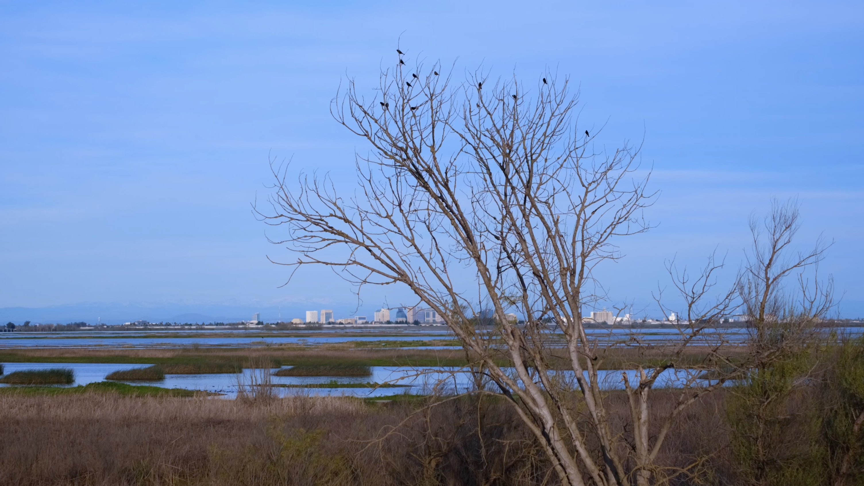
I've lived in Davis almost my entire life. I've driven past the Yolo Basin hundreds of times on I-80, like many people who live in Davis have. To me it was easy to overlook, a pretty landscape during the winters when it flooded and not a whole lot more. I misunderstood it. I didn't actually visit it until January 2026 when I decided to explore the basin for my MFA thesis.
There is a lot going on in this space! The basin simultaneously functions as flood control infrastructure, critical migratory bird habitat along the Pacific Flyway, and agricultural land. These roles don't happen separately. They layer on top of each other, shifting with the seasons.
This thesis is an attempt to close that gap through information design, interactive systems, and a planet-centered framework that puts the ecosystem at the center of the work rather than treating it as backdrop. The project translates environmental data and field research into things people can actually encounter in different forms of media and place of time: a website, risograph posters, literature review zines, and a physical exhibition at the Shrem Museum.
the yolo basin
The basin operates across three overlapping identities: flood infrastructure in winter, migratory bird habitat in spring, and agricultural land through summer. These roles do not happen separately.
The big idea behind this thesis is that the Yolo Basin is a living landscape where flood, food, and flight intersect across every season. Design can make that story visible.

basin timeline
The Yolo Basin has a long history of flood, management, and ecological work. Key moments from 1851 to today, from the Great Flood to the 2025 Big Notch salmonid restoration project. Click on each event to learn more.
Fremont, the first Yolo County seat, is wiped out by floods at the Sacramento and Feather River confluence. An early and dramatic reminder of the basin's vulnerability to seasonal flooding.
The largest recorded flood in the history of California, following several severe storms in succession. The Sacramento Valley becomes an inland sea for weeks, reshaping the region's relationship to water and flood management for generations.
The State Legislature enacts flood control legislation and construction of major infrastructure begins. The Yolo Basin begins its transformation into a managed floodplain, both ecological system and engineered landscape.
March 18th: the original causeway opens, stretching 3.13 miles across the floodplain. A three-day celebration is held. The causeway becomes one of the longest bridges in the western United States, and the structure most people associate with the basin today.
Established as a federal project under the U.S. Army Corps of Engineers. The Yolo Bypass is engineered into the landscape: land functioning simultaneously as infrastructure and ecological system.
The first Audubon Christmas Bird Count in the Sacramento circle begins, covering part of the Bypass. An early instance of citizen science documenting the basin's extraordinary migratory bird habitat along the Pacific Flyway.
A community organization is established with plans to assist in the creation of the Yolo Bypass Wildlife Area. The Foundation becomes a key advocate for the basin's conservation and public access.
The U.S. House approves $1.6 million in the Army Corps budget for the Yolo Basin Wetlands Project. The State Wildlife Conservation Board separately approves $4.75 million for a 3,100-acre land purchase. A turning point for the basin as recognized habitat.
The California Department of Fish & Wildlife opens the Yolo Bypass Wildlife Area to the public. For the first time, people can formally visit and experience the basin, fifteen minutes from Davis.
UC Davis and the Department of Water Resources Trout begin collaborative research on flooded rice fields as salmon habitat. The Nigiri Project demonstrates that agricultural land and fish habitat can coexist, and even support each other.
Yolo Bypass Salmonid Habitat Restoration and Fish Passage is completed. The Big Notch project improves fish passage through the bypass, reconnecting salmon to historic habitat and marking a new chapter in the basin's ecological restoration.
research methods
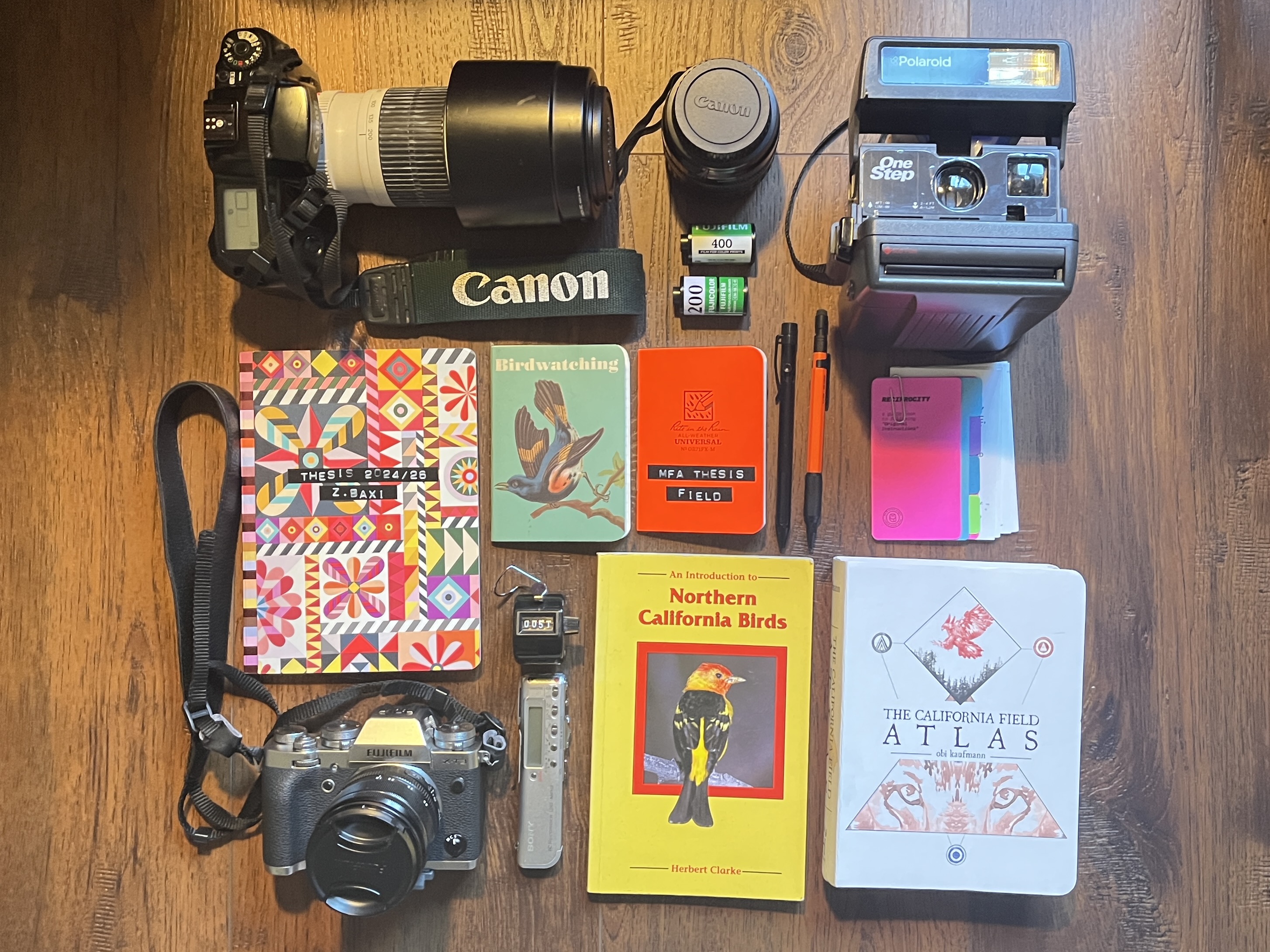
Research for this project was conducted on site as well as through books, journal articles, and citizen science online resources. I spent time walking and photographing the basin across different seasons, mapping spatial and seasonal patterns, and collecting data from environmental research monitoring projects, and working alongside UCD researchers. I also completed an extensive creative literature review system based on books about floodplains, migratory habitats, citizen science, and design communication.
I also in my first year in the MFA program at UC Davis explored other methods of design and communication. You can explore a side quest exploration within the space of card games and enviromental communication within reserved land spaces here ↗.
influences
Three projects shaped how I thought about communicating ecological information to public audiences.
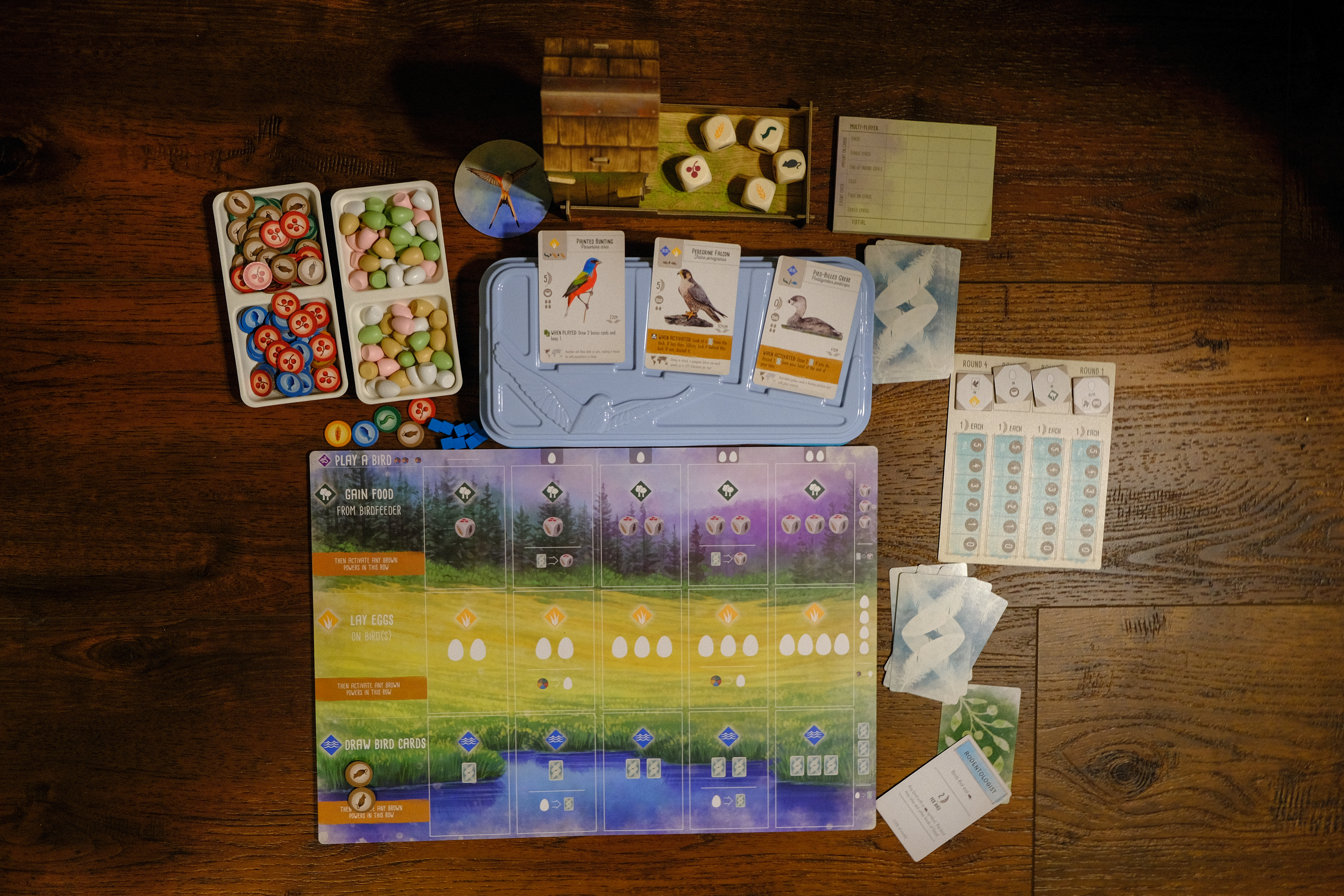
Wingspan (2019) showed how real ecological data can become a playable, learnable system without losing scientific accuracy. Players learn bird behaviors through repeated interaction rather than instruction. Learn more about the game here ↗.
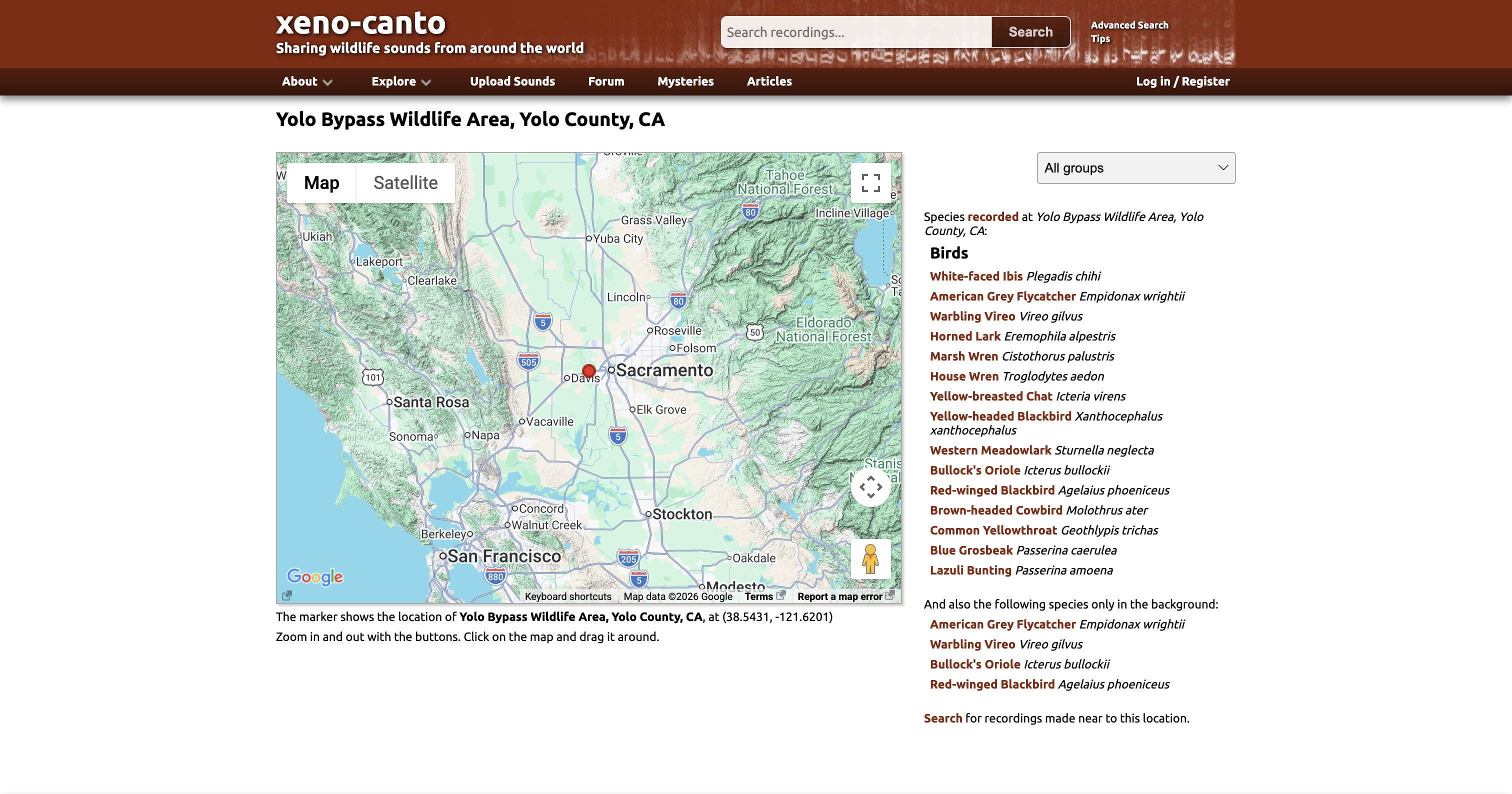
Xeno-canto (2005) translates birdsong into visual spectrograms paired with geographic metadata, creating an interface that works for both experts and curious newcomers. It also demonstrated how crowdsourced citizen science can fill gaps that long-duration data collection cannot. Check out xeno-canto.org ↗ and find Yolo Basin specific recordings here: Yolo Basin species page ↗
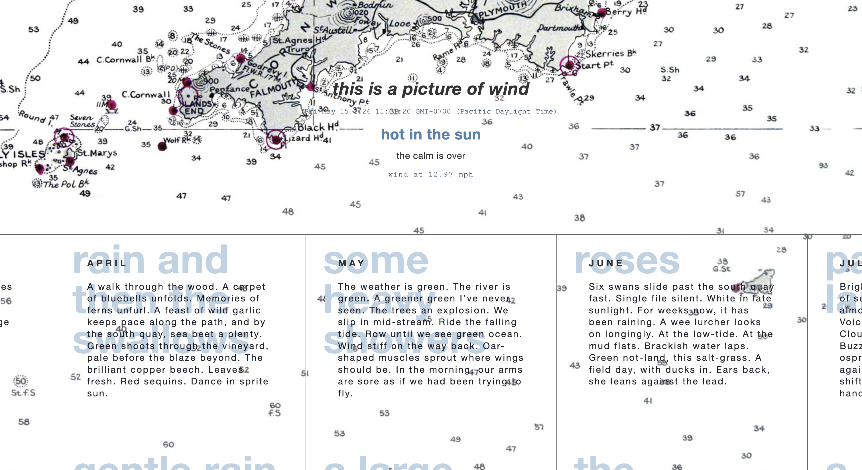
This Is a Picture of Wind (2018) by JR Carpenter is a hybrid web and print project documenting flooding through diary entries. It showed how multiple formats create multiple entry points into the same material. I suggest actually checking this website out as it's very beautiful and made with code! https://luckysoap.com/apictureofwind/main.html ↗
Together these pointed toward an approach built on interactive learning, participatory ecology, and personal storytelling around ecological concerns.
design outputs
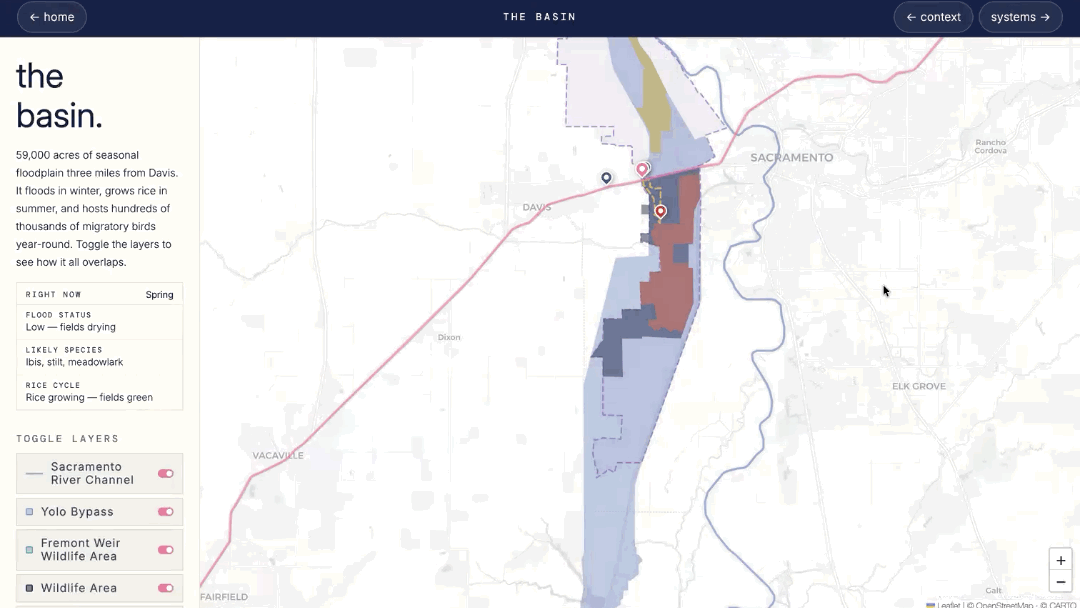
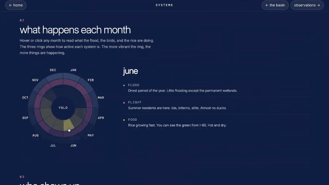
interactive website
Visit the interactive website @ floodplainfutures.github.io ↗
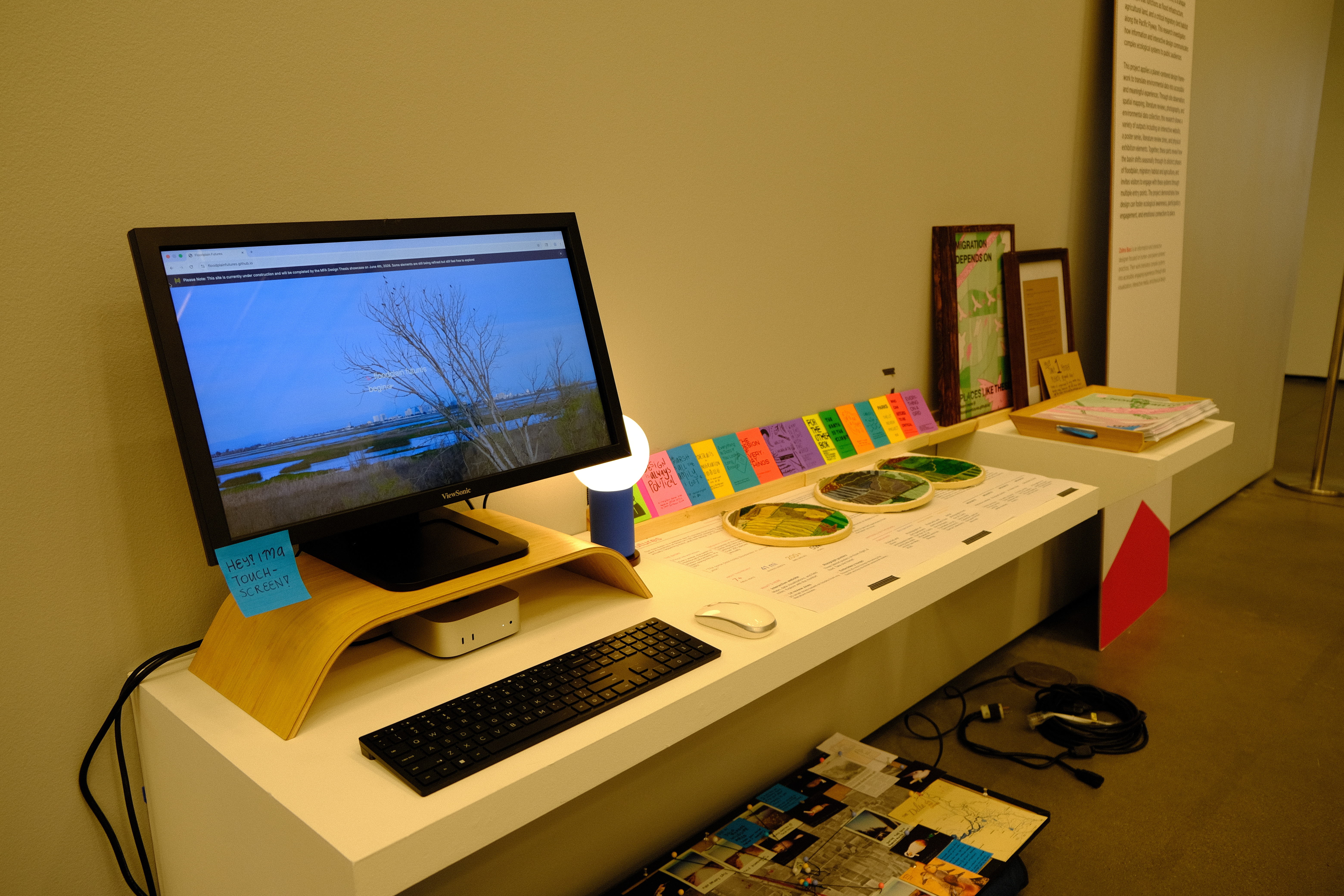
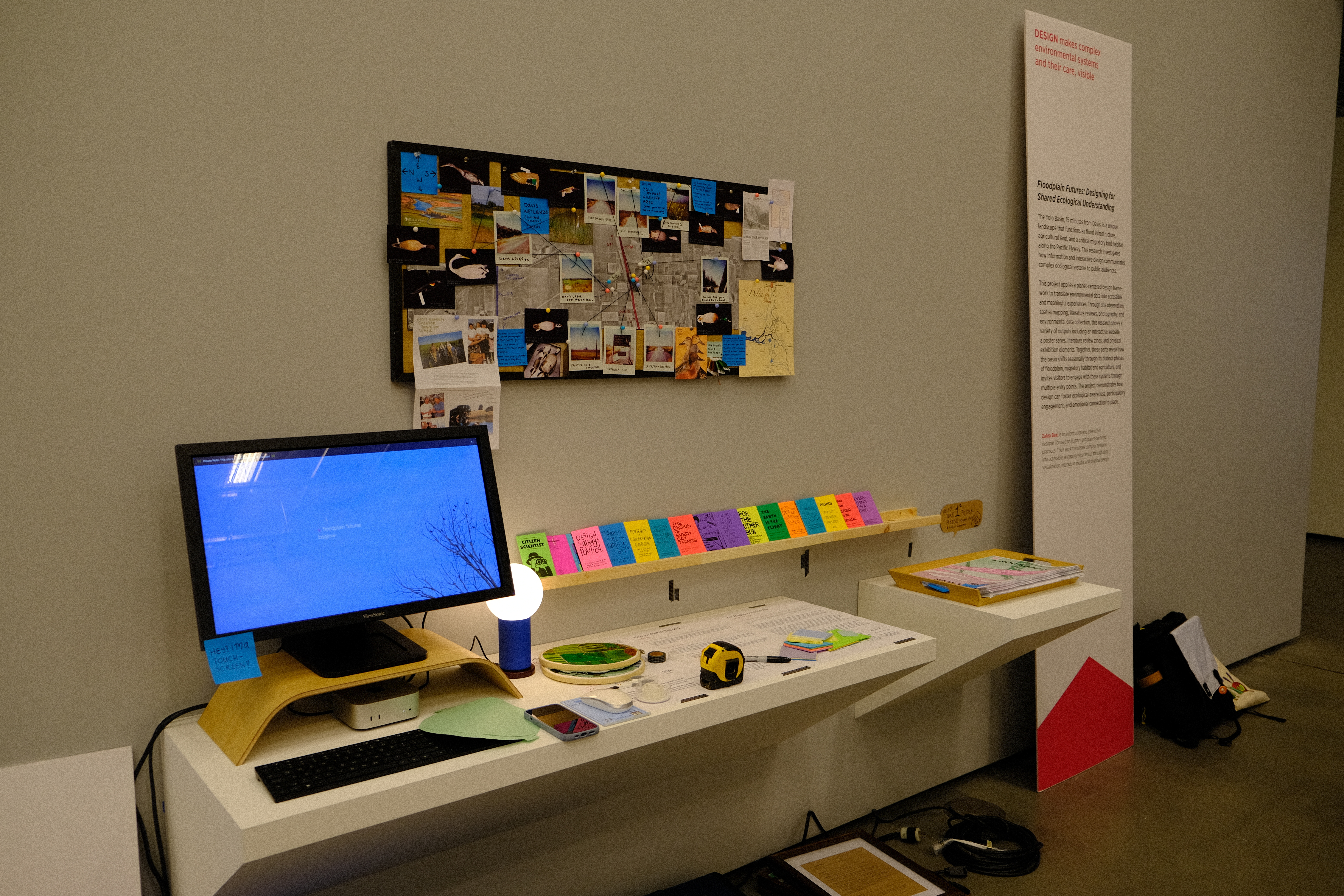
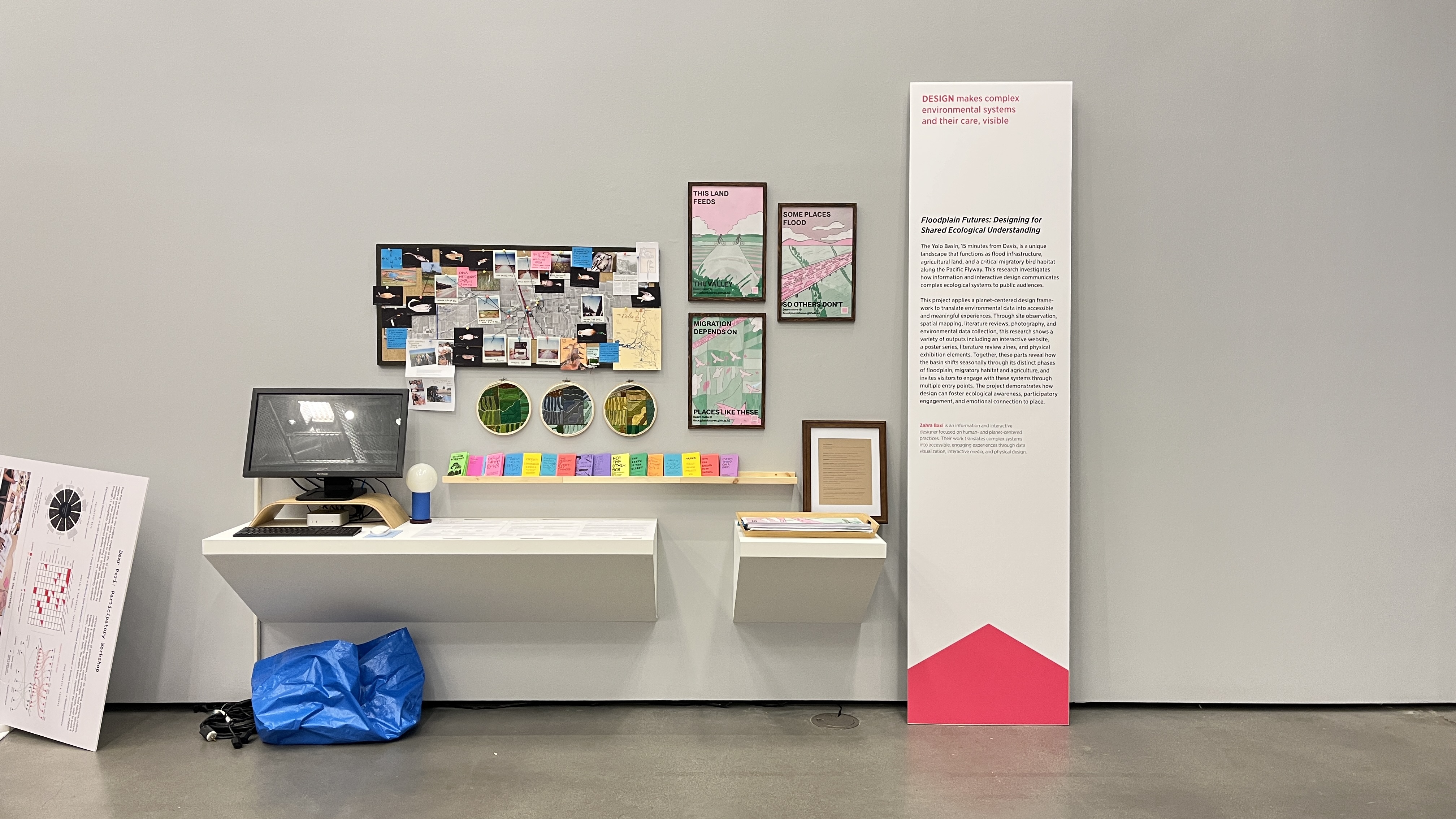
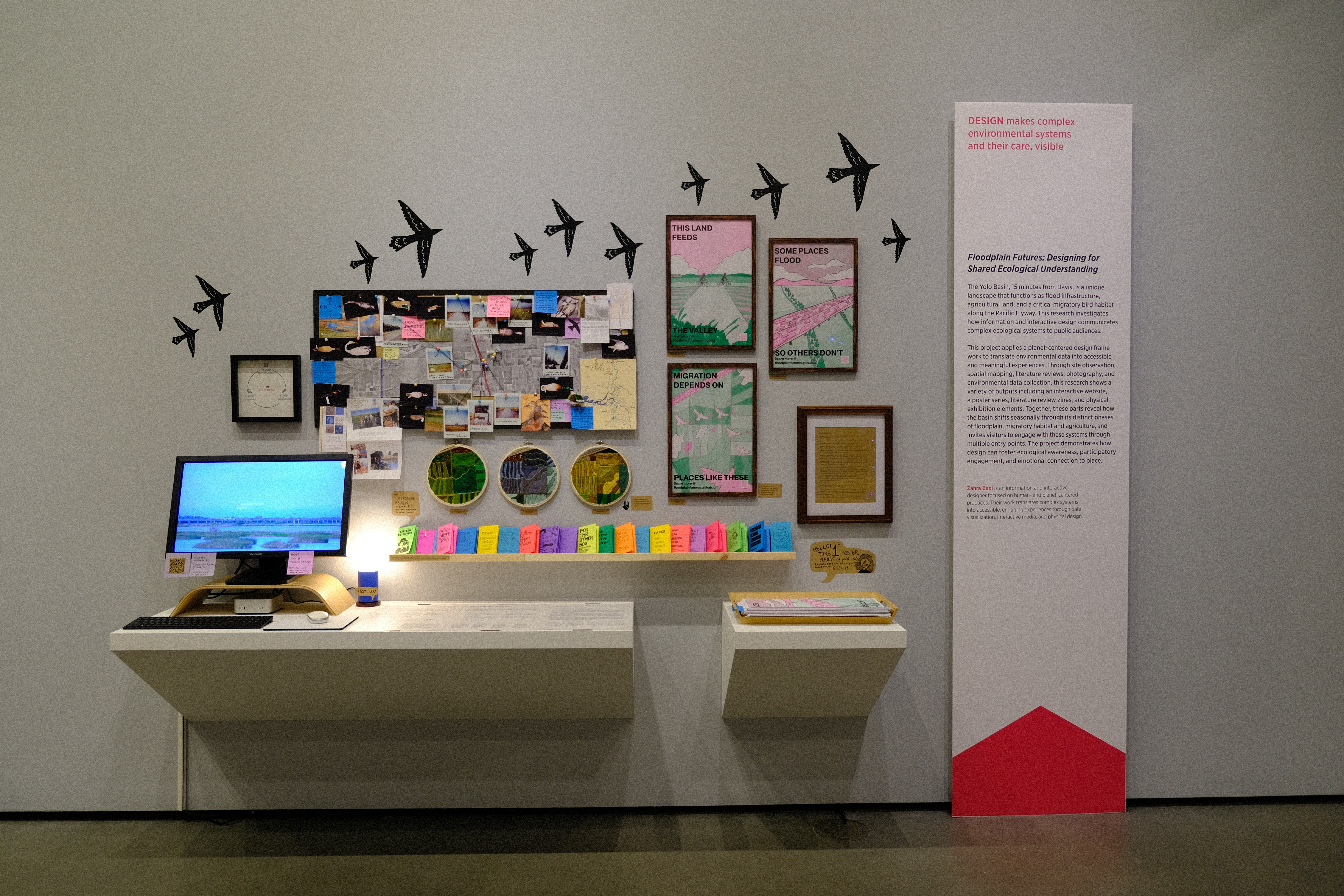
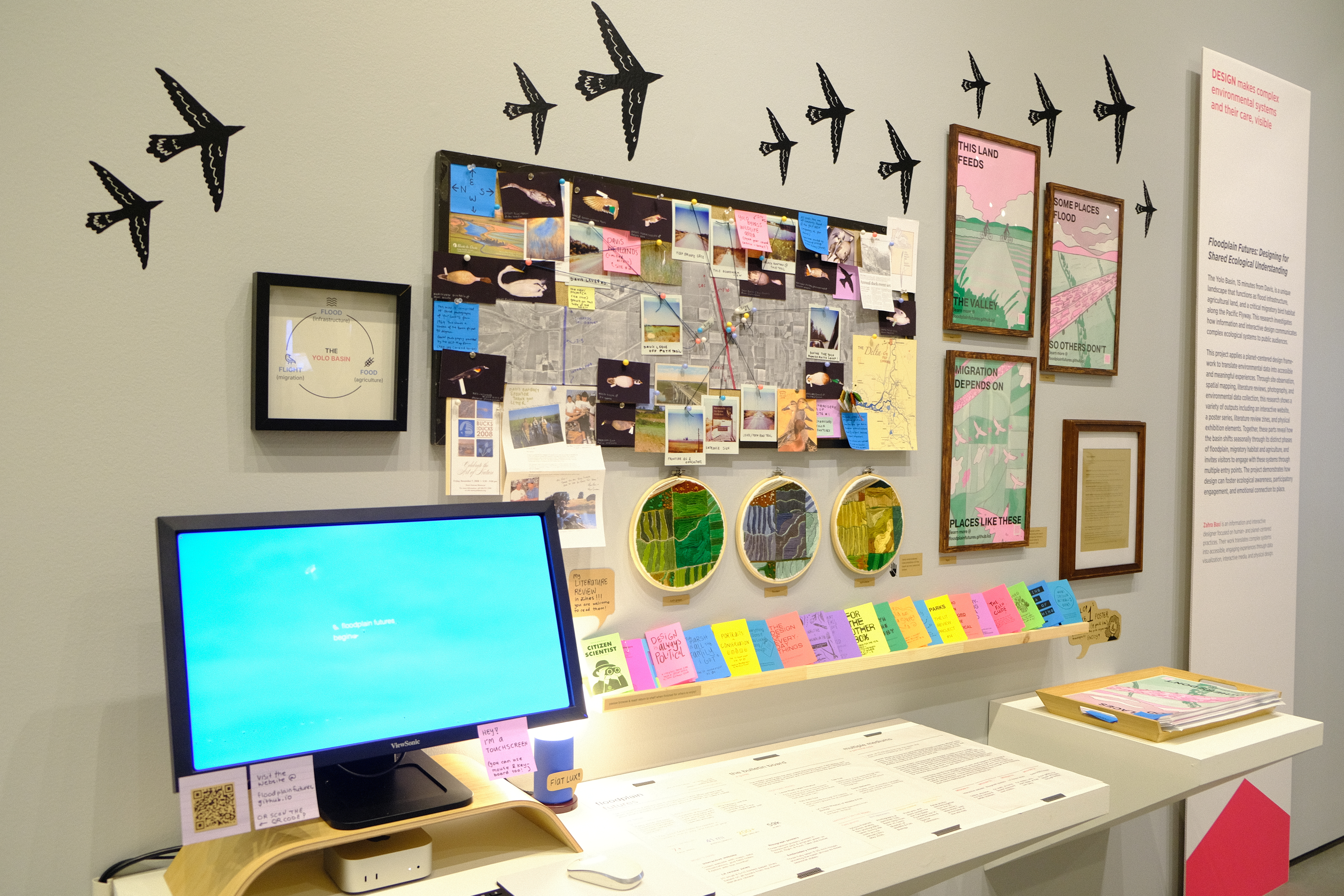
The website is the central platform for the project. Built in HTML, CSS, and JavaScript, it features interactive maps showing basin geography and seasonal change, data visualizations of ecological processes, and field notes from site visits. It is designed to be displayed on a monitor as part of the exhibition and accessible online.
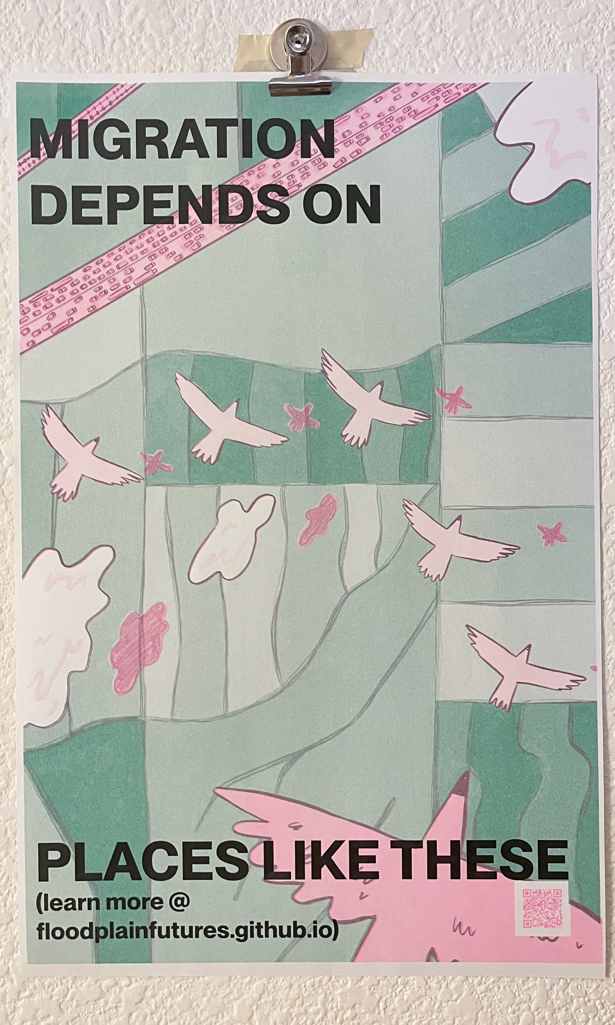
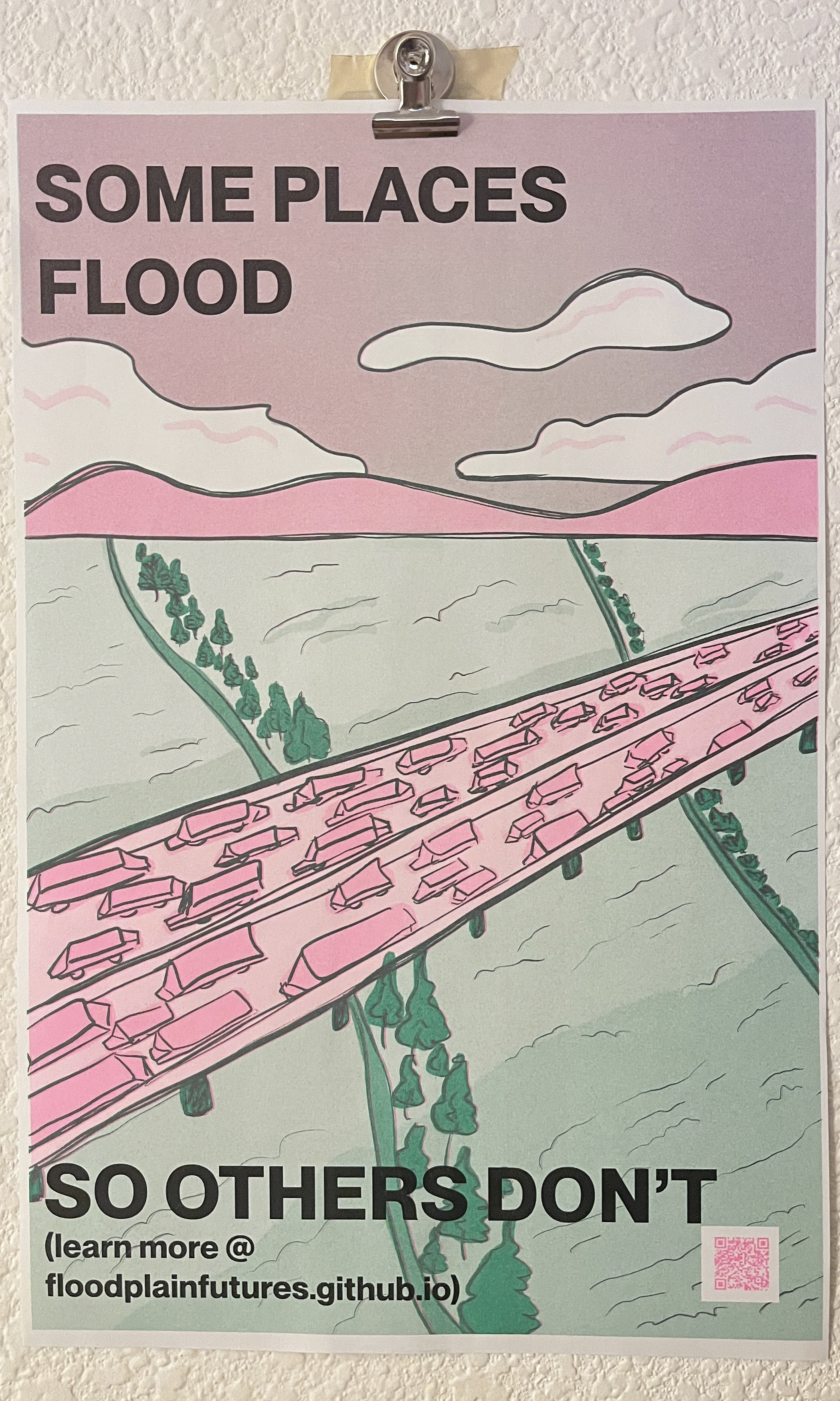
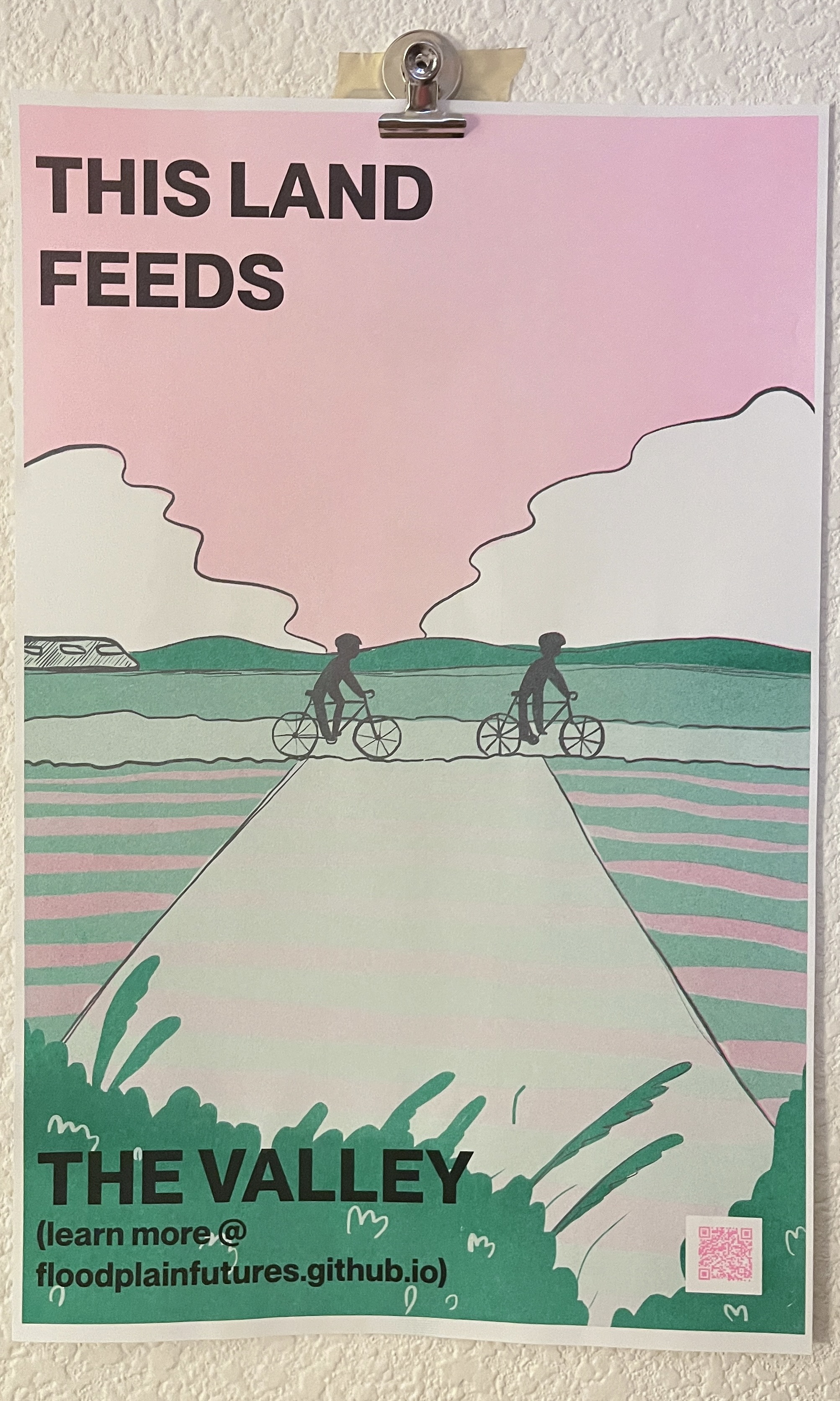
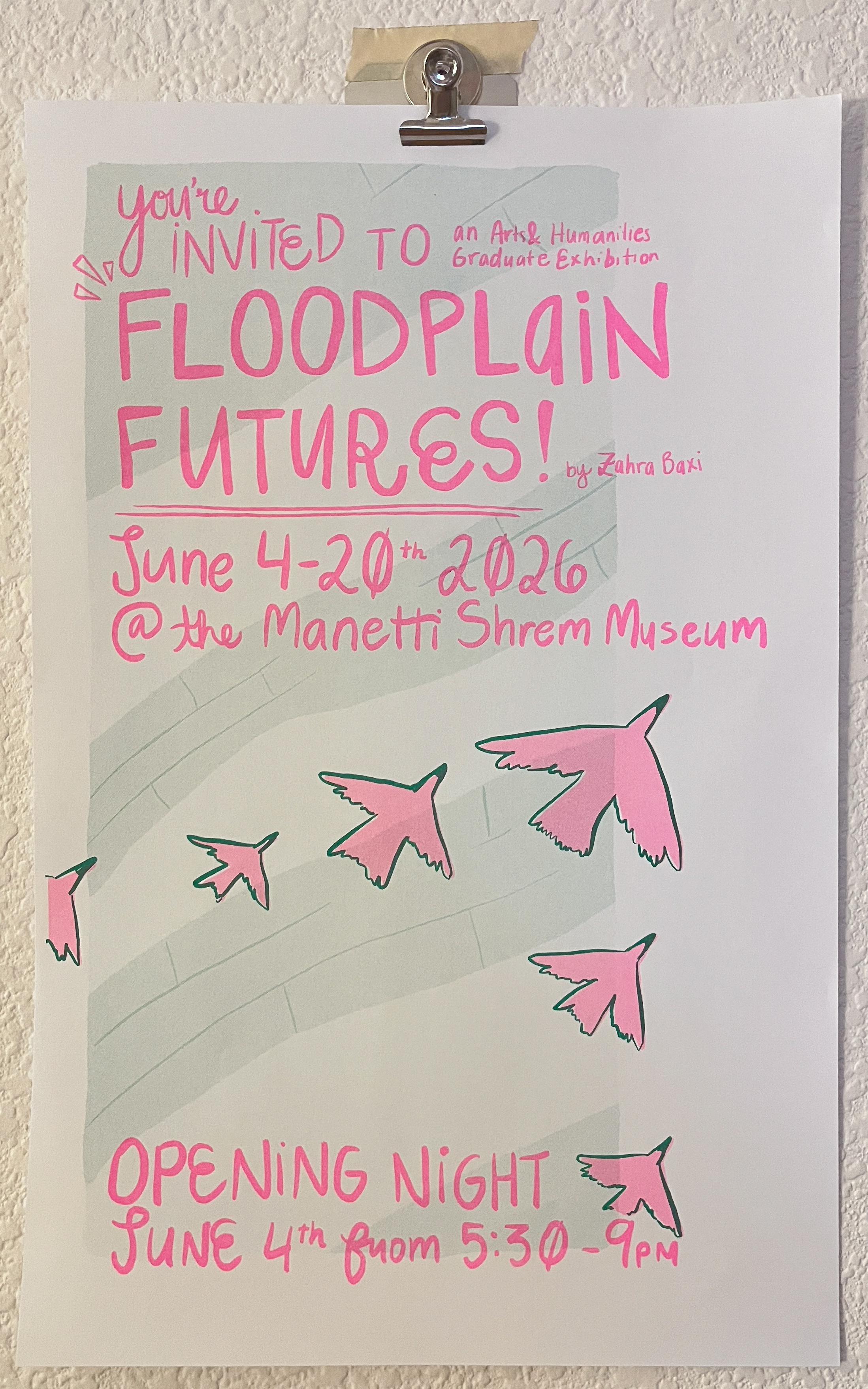
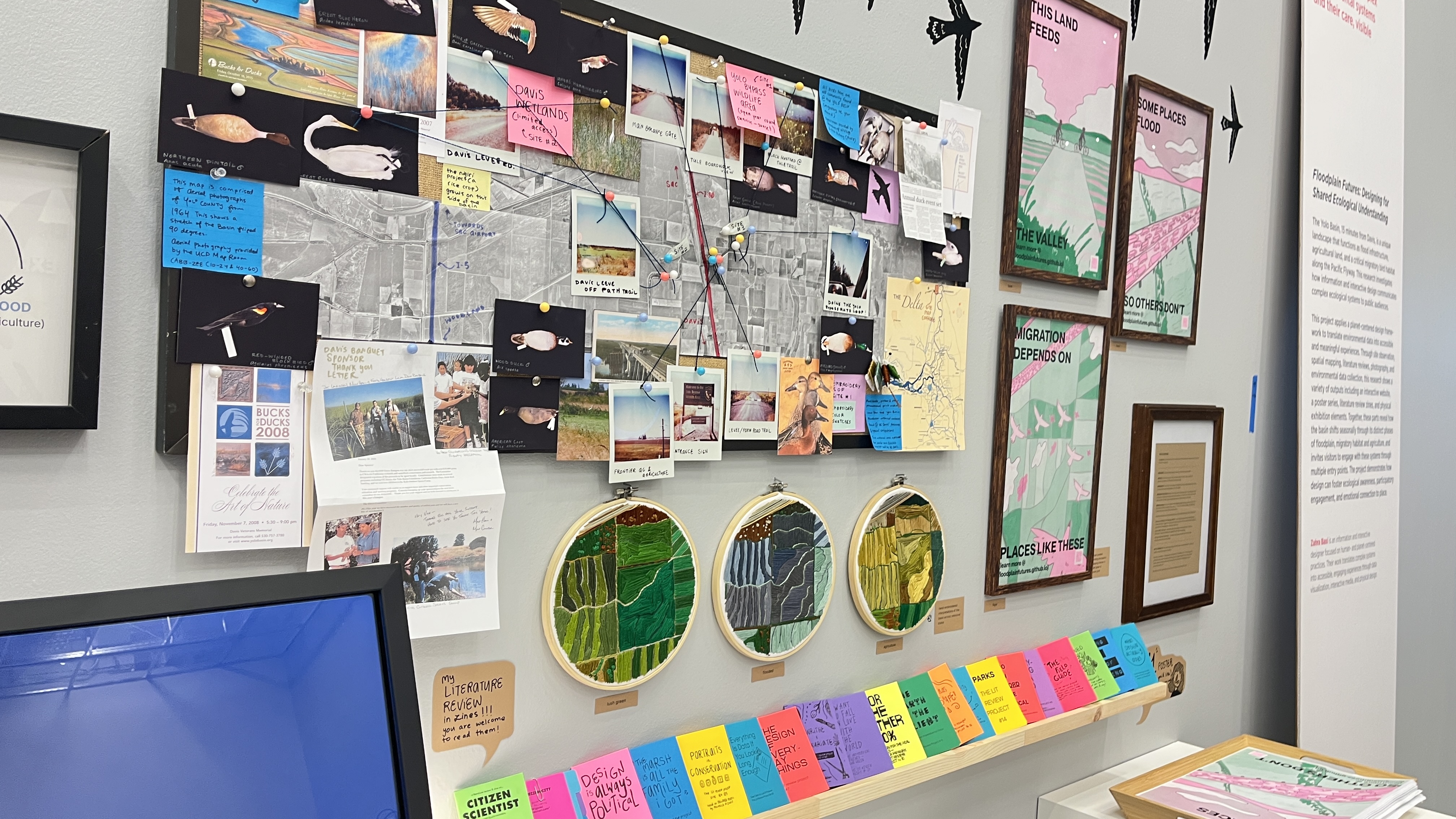
poster series
Four risograph-printed posters: three tabloid posters on the basin's core themes (flood, migration, and agriculture), plus a hand-lettered invite poster for the opening night. Printed with the UC CAAN Davis site's Risograph in emerald green & fluorescent pink, then overprinted in black. 300 copies were mass-printed so visitors can take one home.
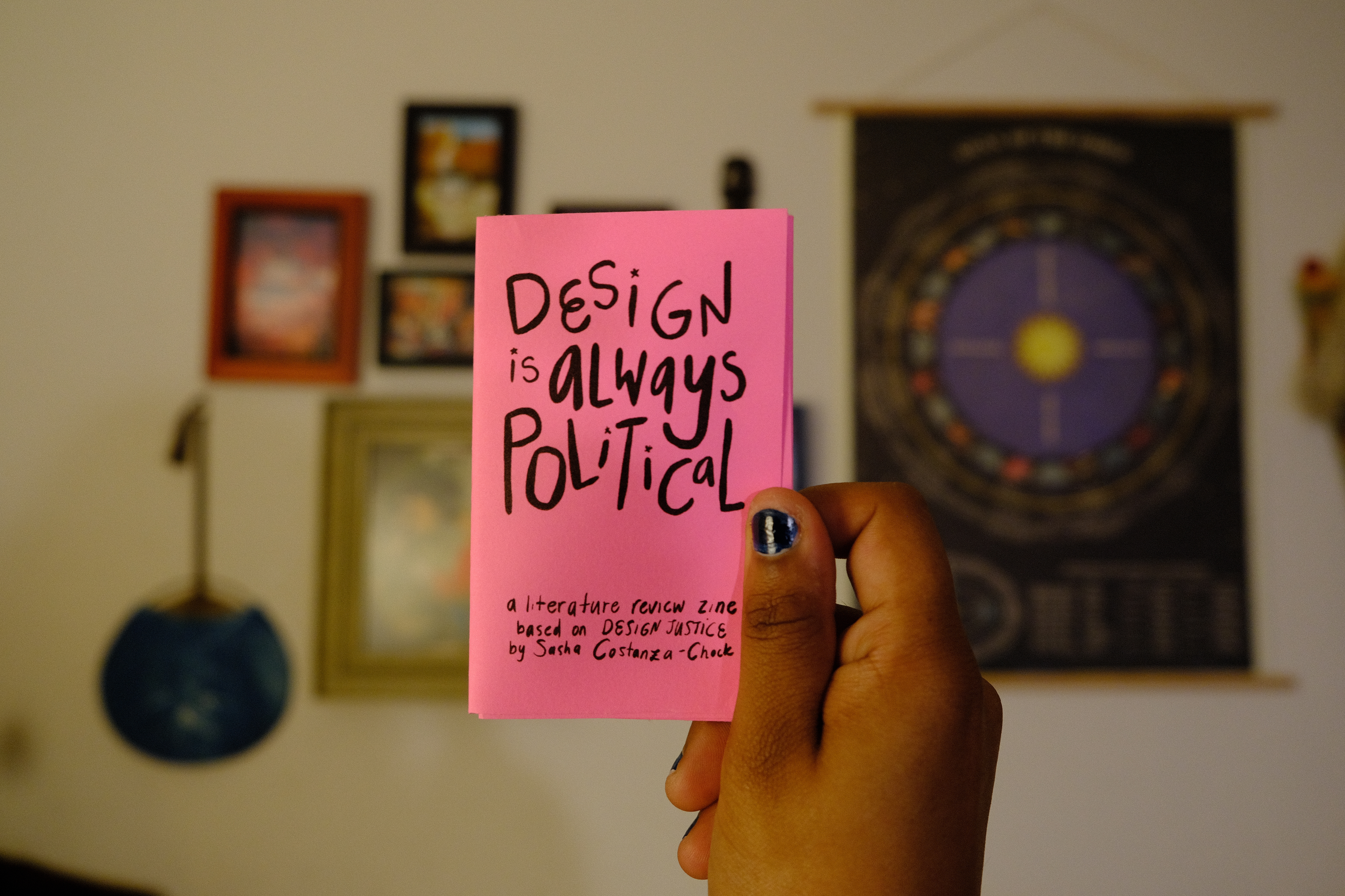
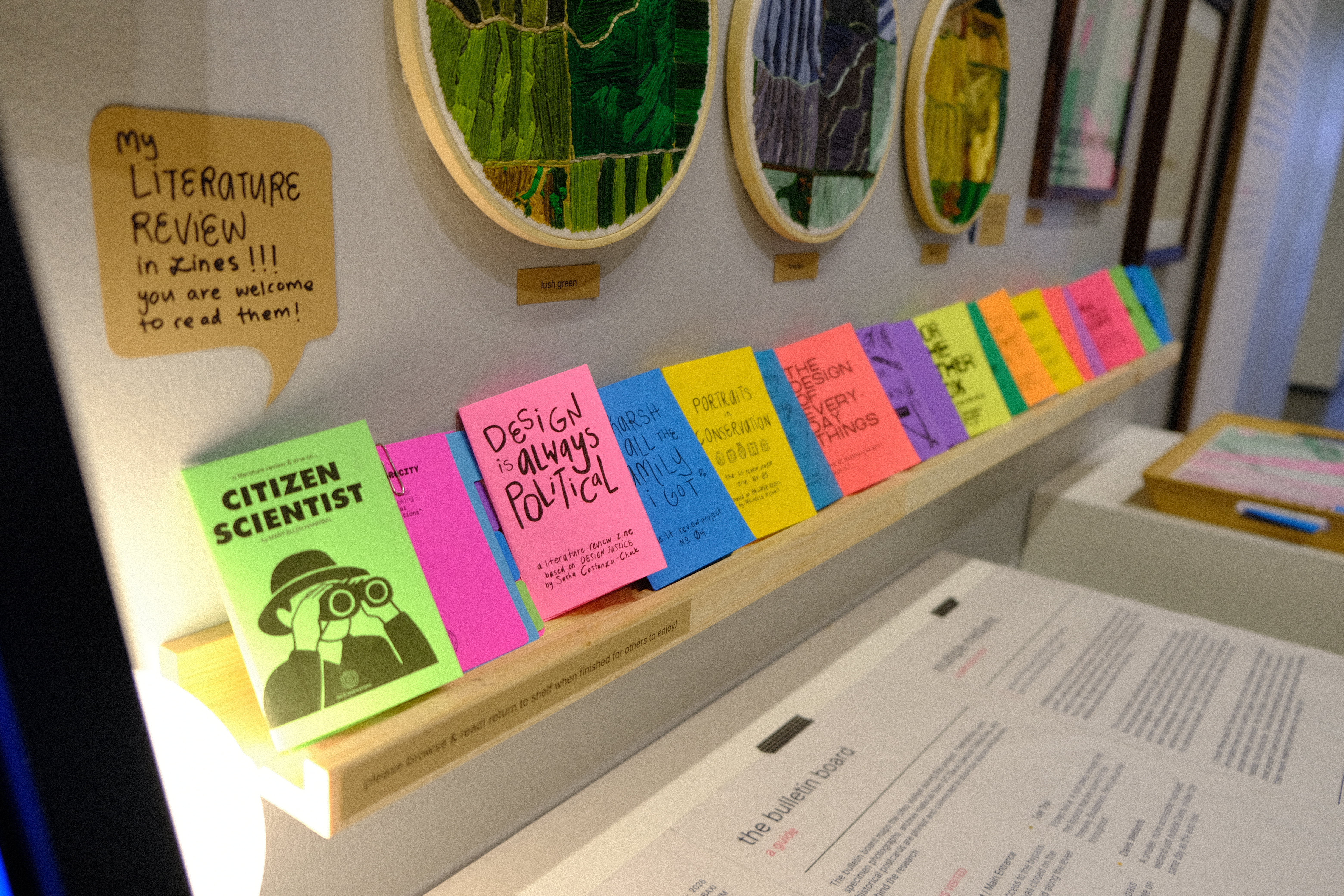
lit review zines
The literature review process is usually a very daunting process when tackling a thesis. It's usually constrainted to a written paper and lacks the interactive and visual elements that could enhance understanding and excited people to want to read them. As part of the literature review process, I decided to create a series of small foldable zines summarizing and interpreting key readings related to the thesis. Topics include ecological systems, data visualization, design communication, citizen science, and the history and geography of the basin. Around 20 zines total, printed on 8.5x11 and folded down. These are also available to view at the exhibition.
Browse the full zine series: The Lit Review Project ↗
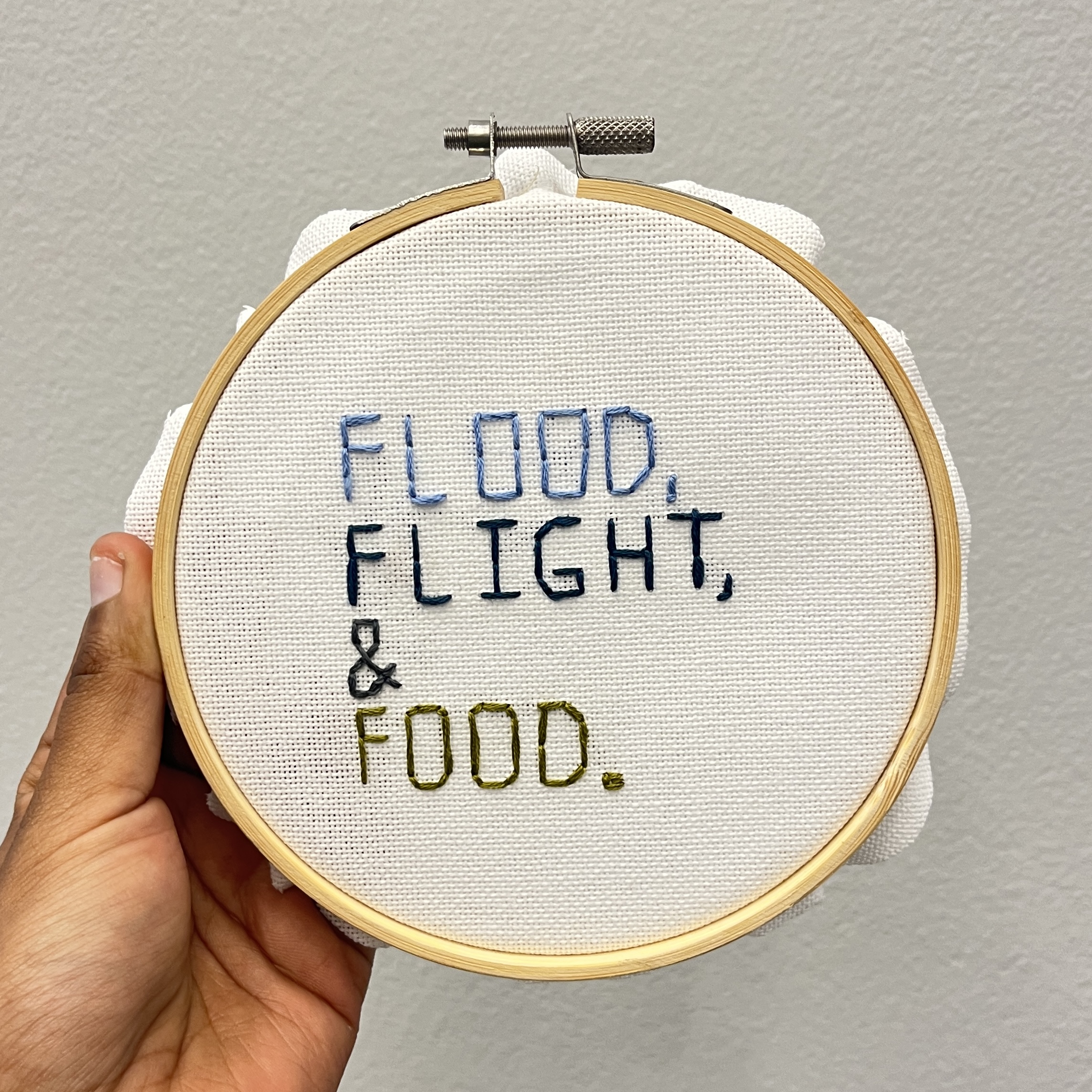
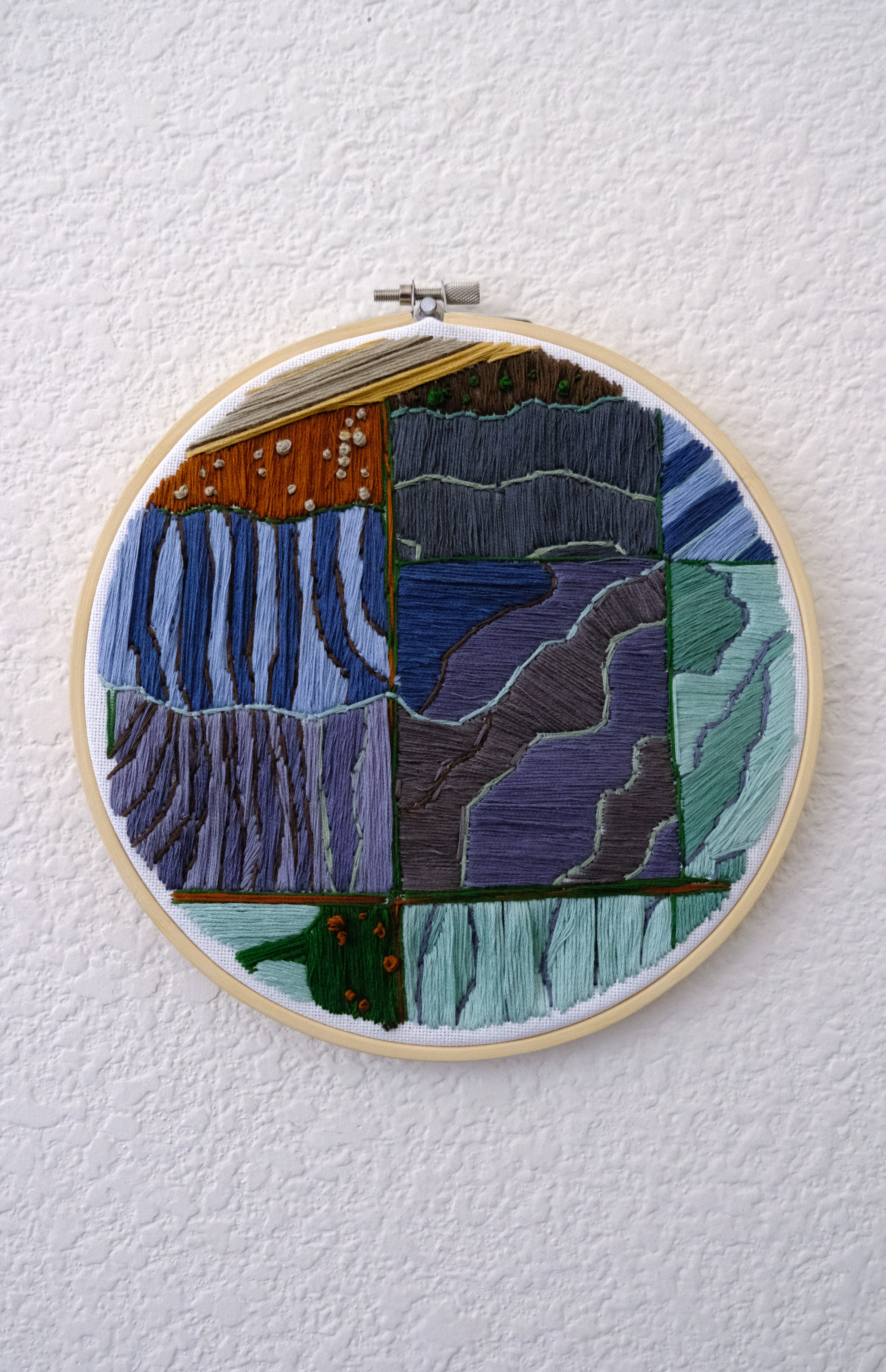
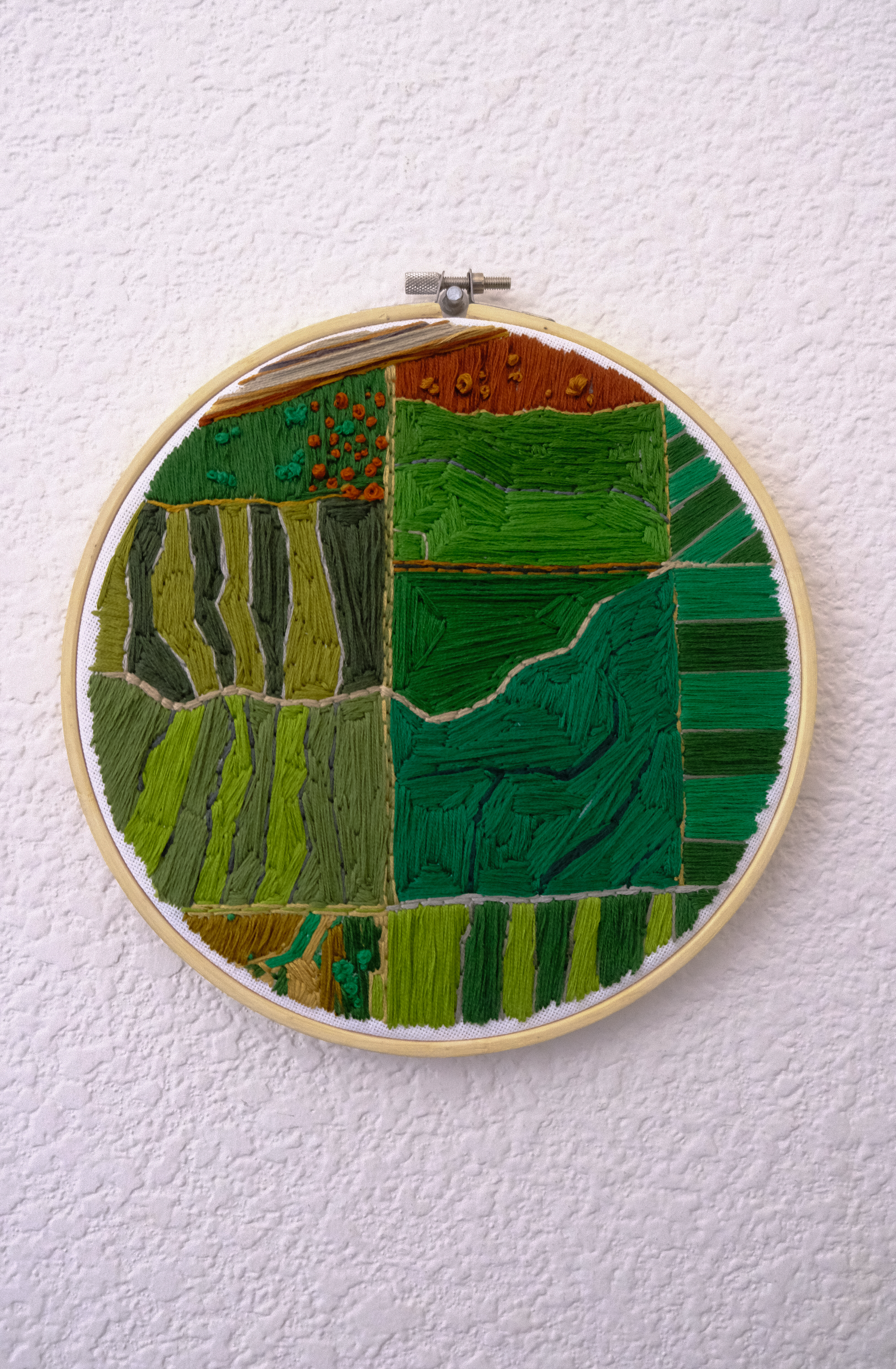
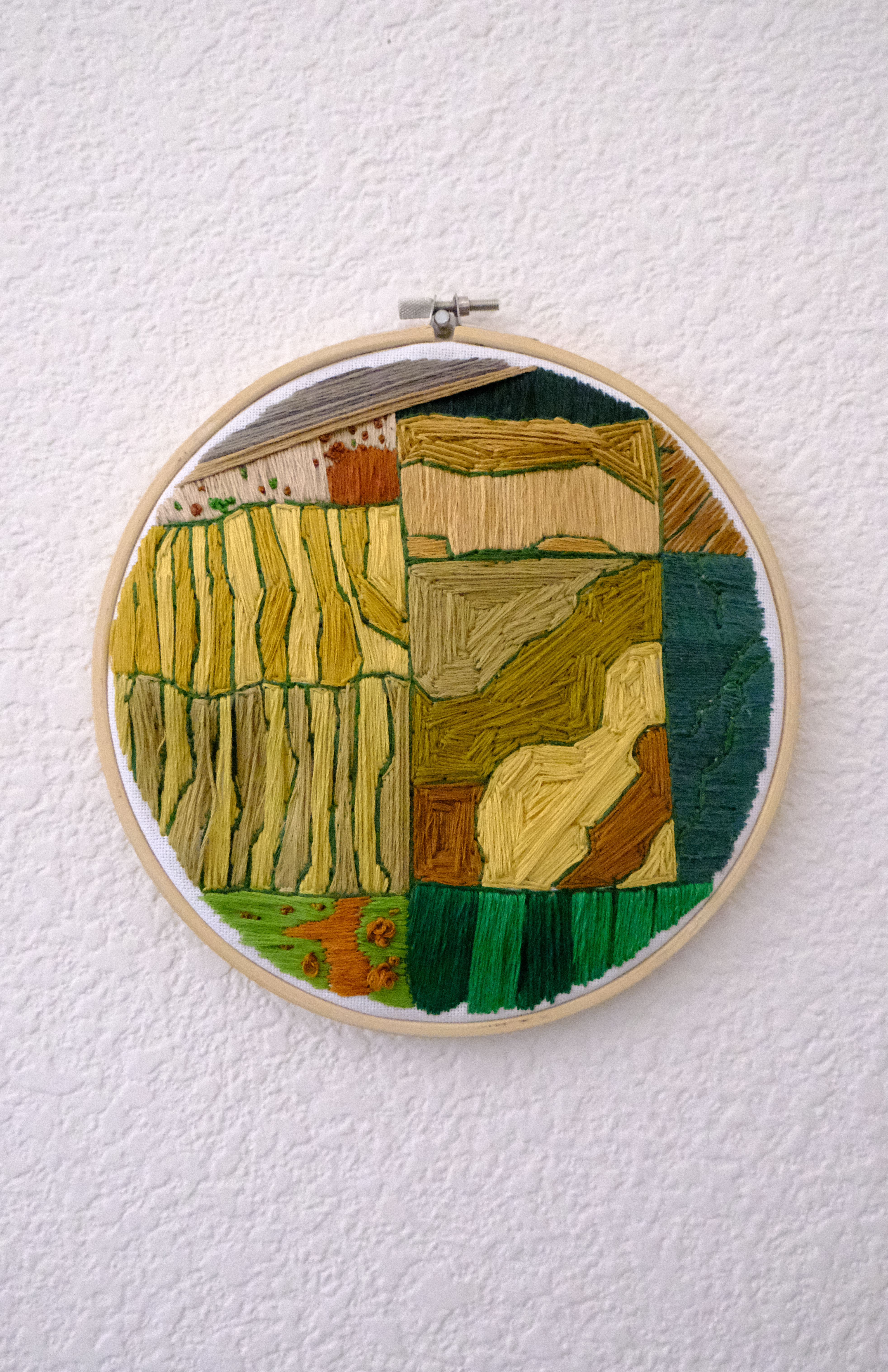
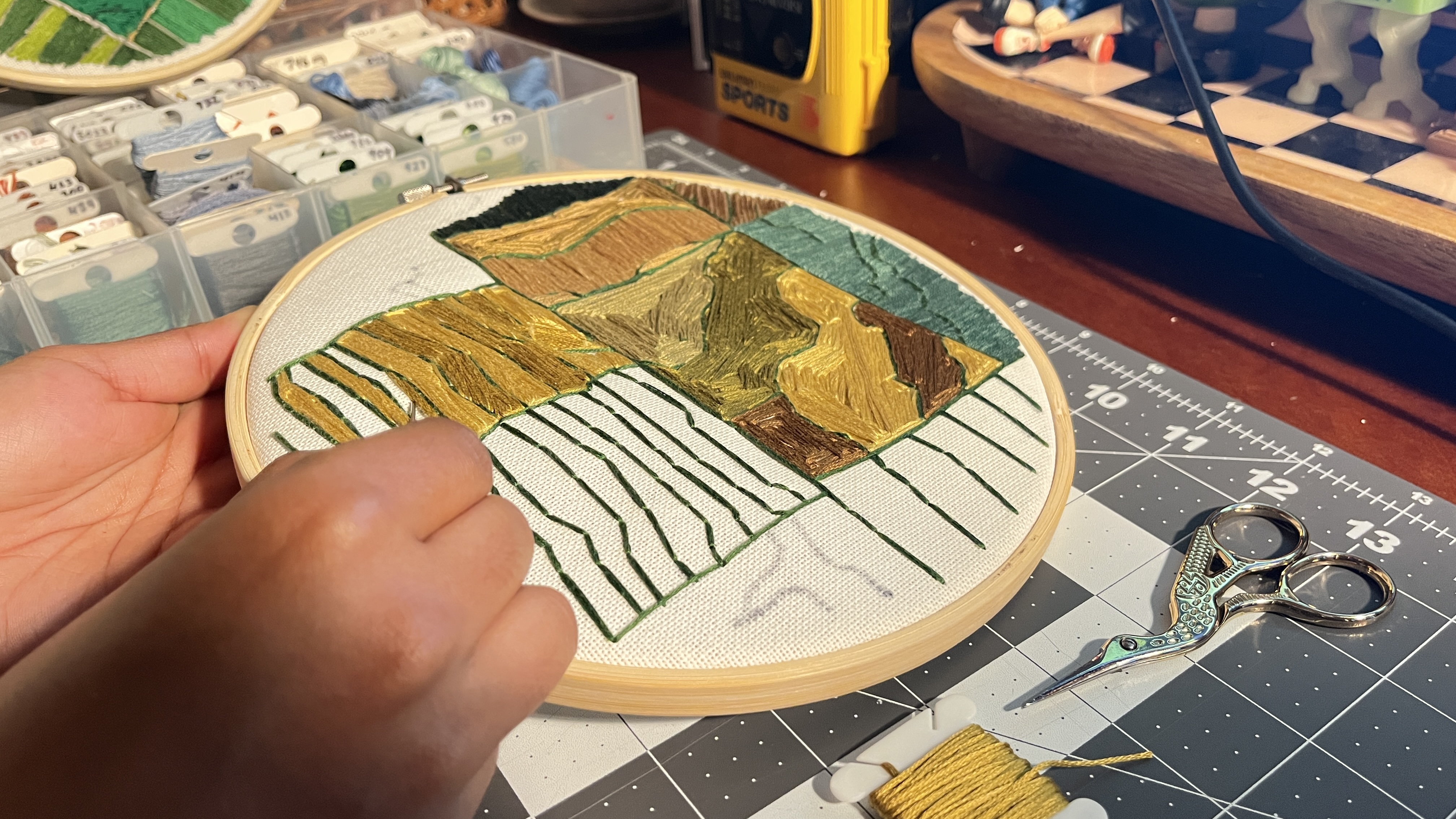
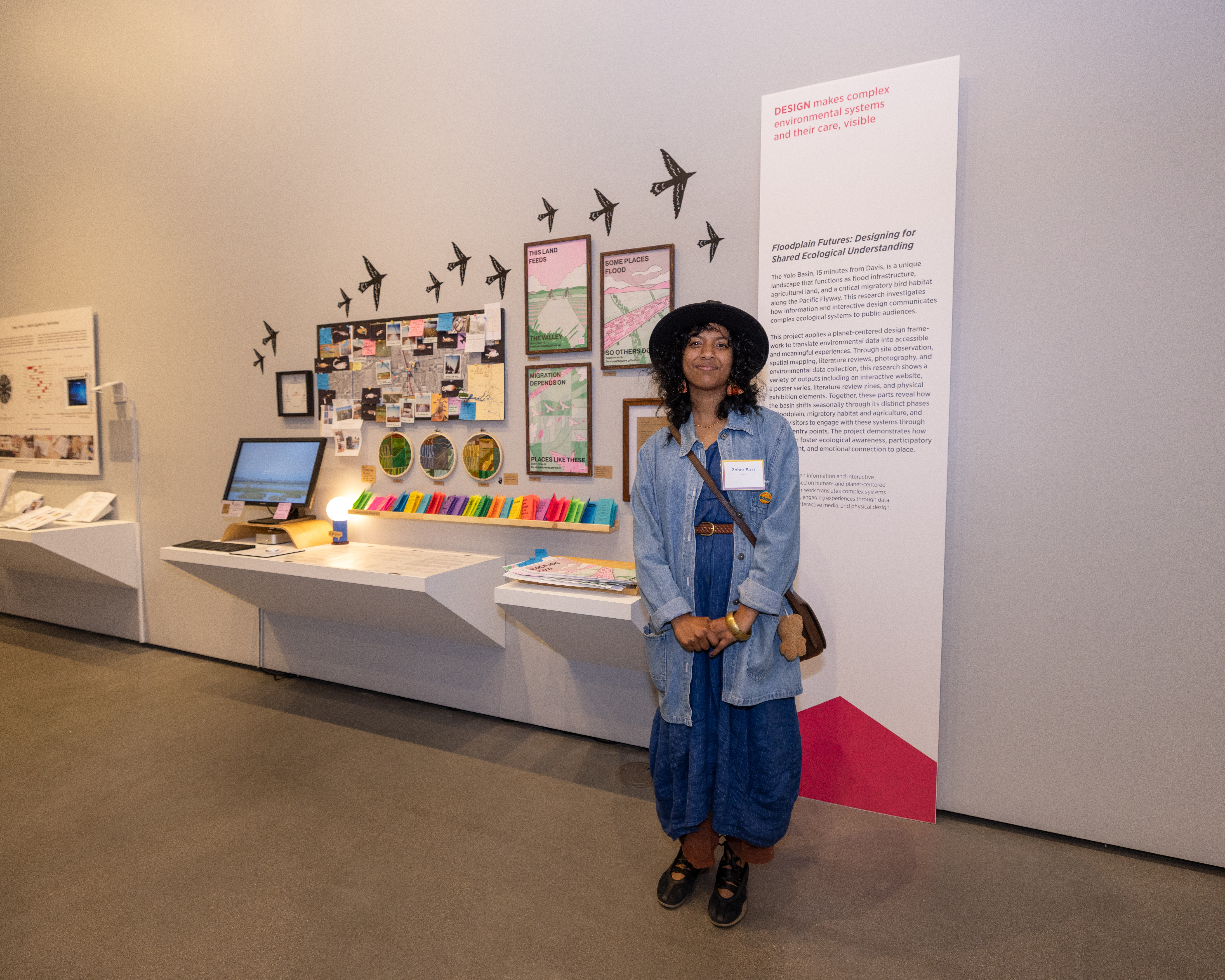
embroidery hoops
Three 6-inch embroidery hoops depicting the basin's three seasonal stages. Each hoop is hand-stitched over printed aerial photographs and maps of the basin, making the abstract geography tactile and intimate. These hung alongside the posters as part of the exhibition wall.
site map
At the exhibition, a large site map places all key locations within the basin I visited during this thesis. Field photos, bird specimen photography, postcards, news clippings, and site maps are pinned and strung together: showing what events have occurred and giving more context to the site itself.
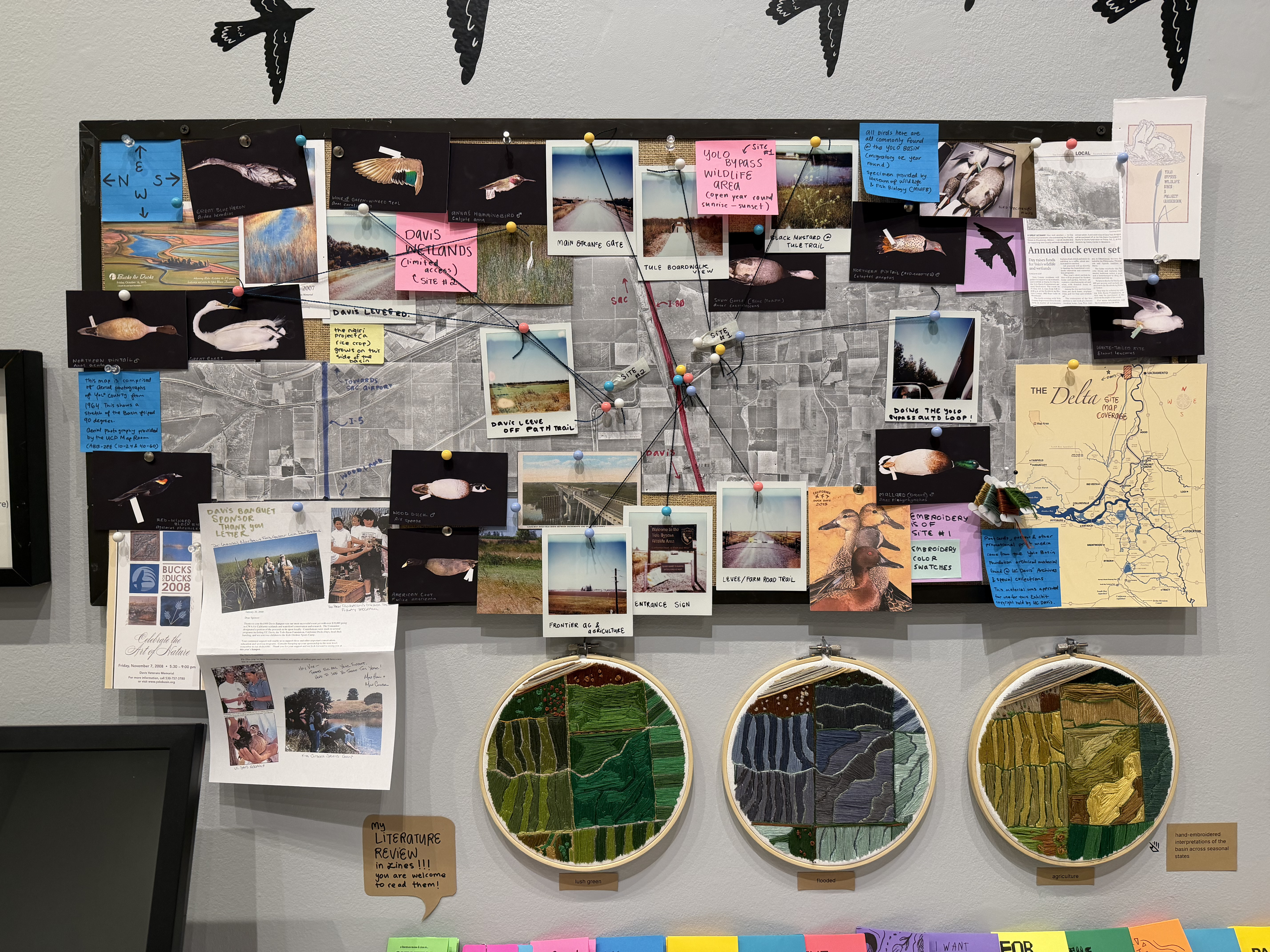
The process of making this site map wouldn't have been possible without the help of many UC Davis organizations and musuems! The UC Davis Map Room helped with finding and scanning the aerial photos of Yolo County (from 1964!) so that I could digitially stitch them together for the giant site map. The Musuem of Fish and Wildlife provided the bird specimen photographed. UC Davis Special Collections and Archives provided the historical postcards, pamplets, posters, informational material and other archival resources from the Yolo Basin Foundation.
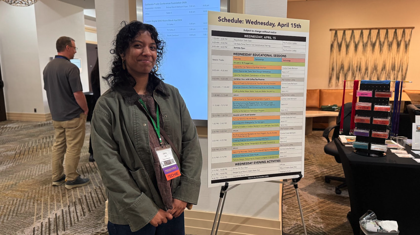
ca trails & greenways conference
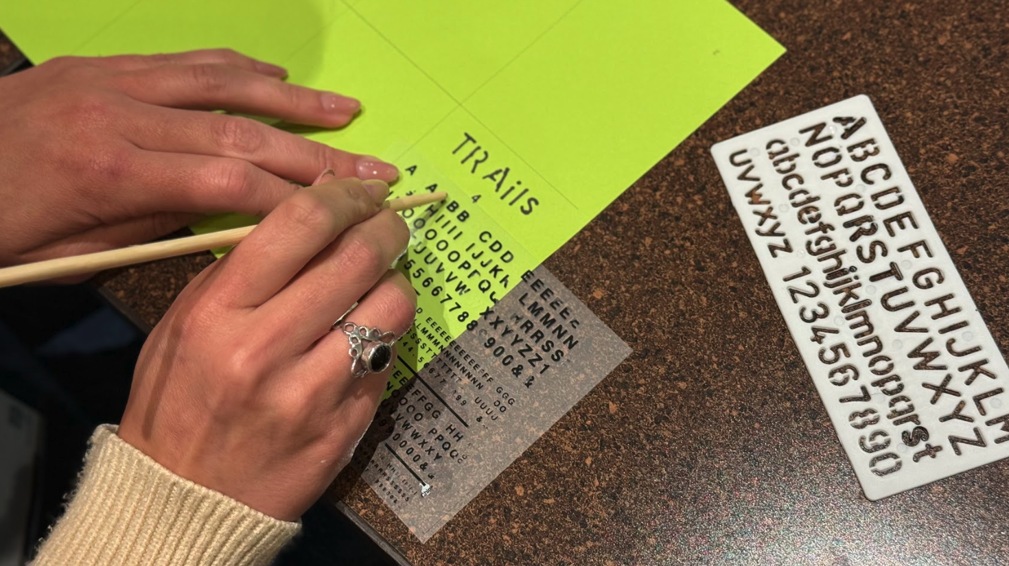
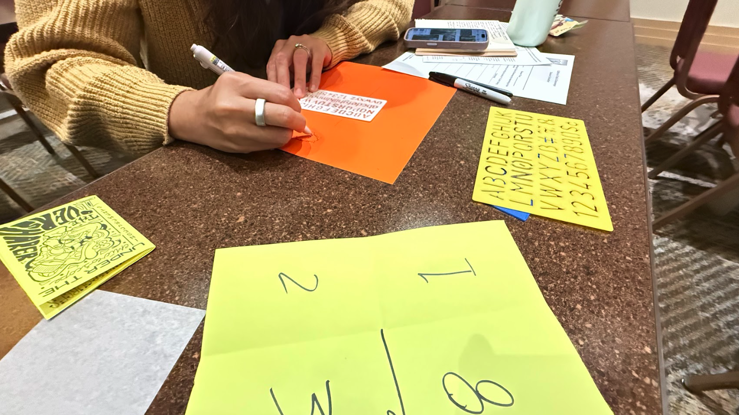
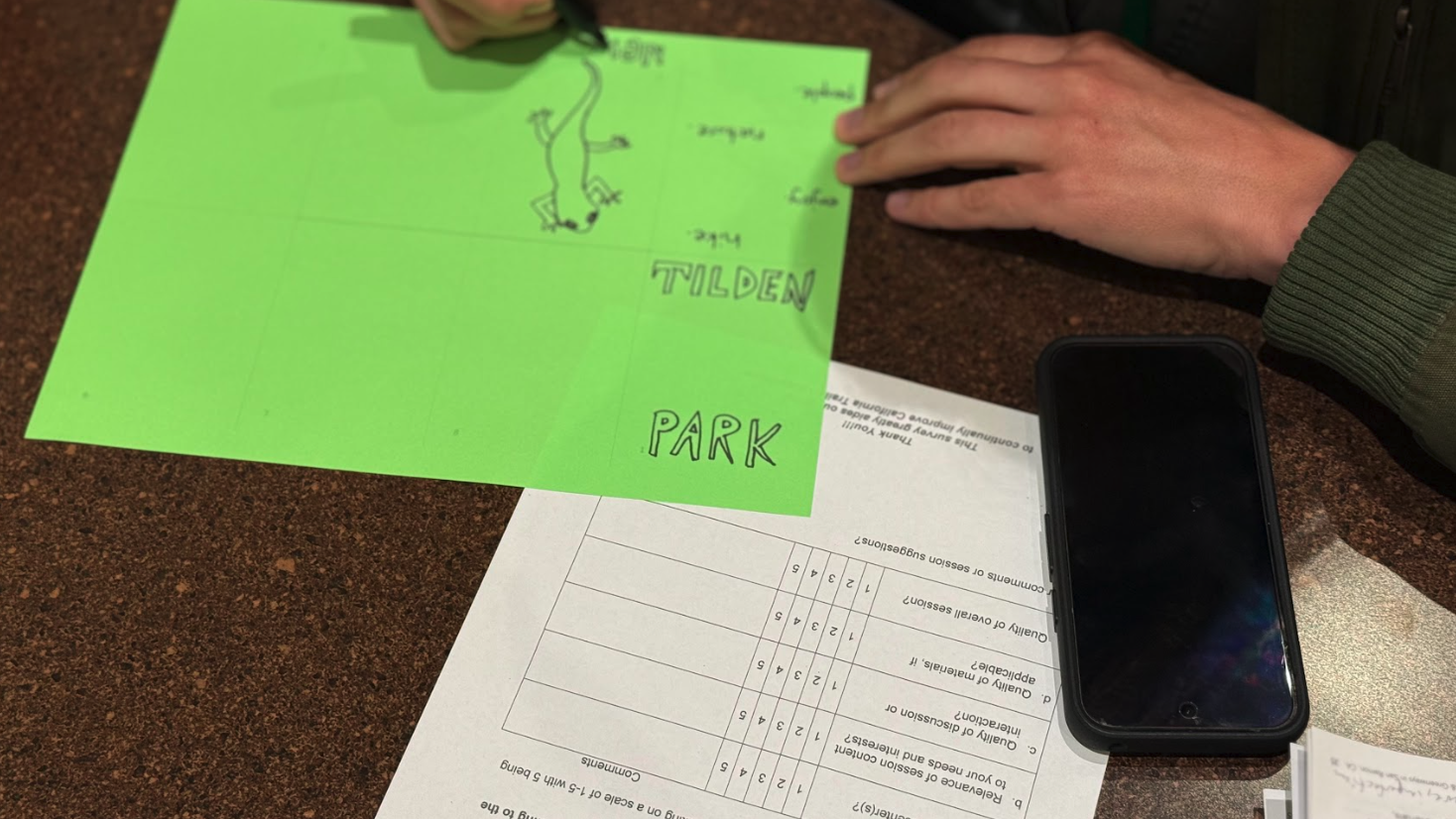
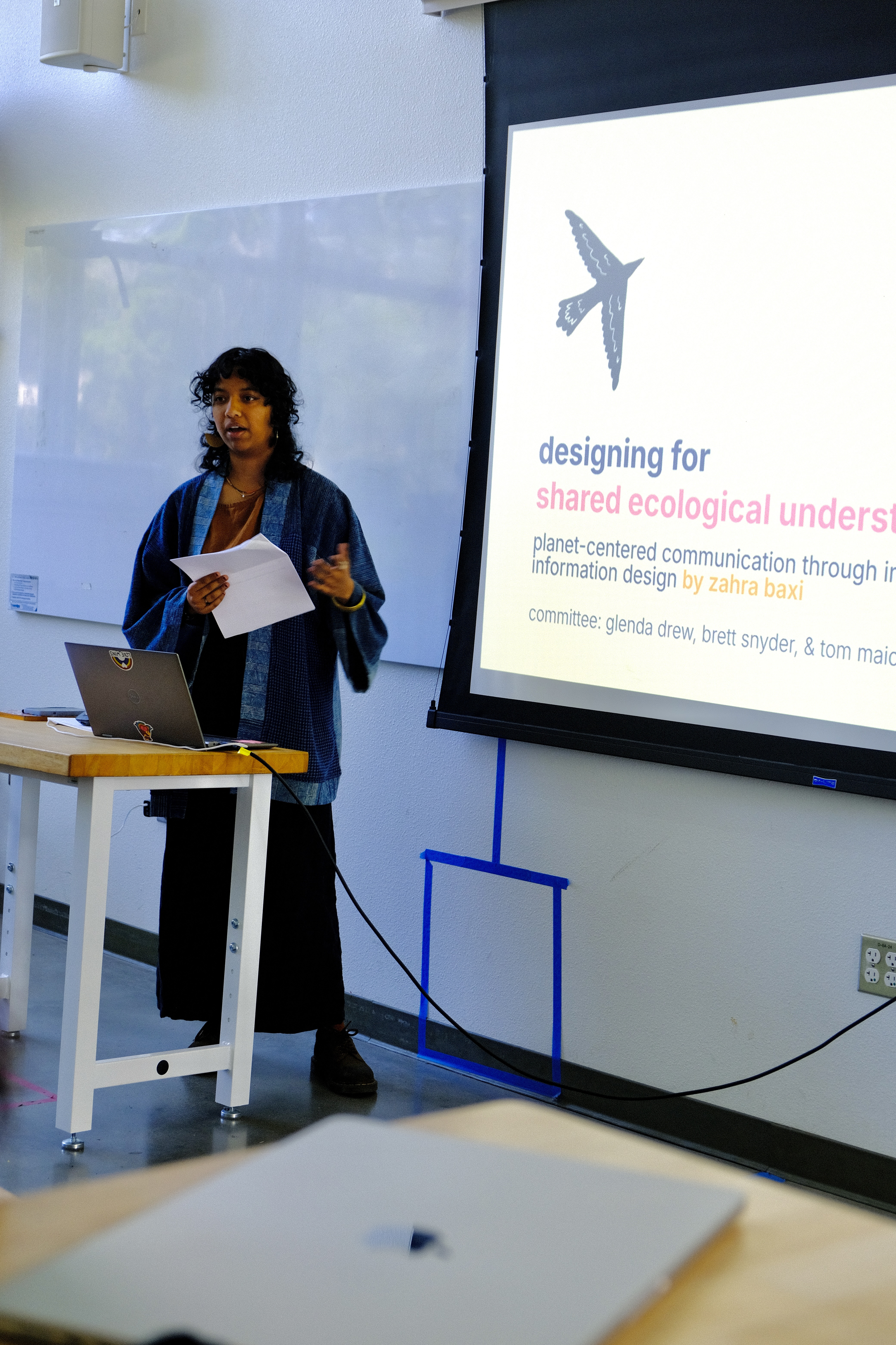
In April 2026, I presented at the California Trails & Greenways Conference with support from my thesis committee chair and long time mentor Glenda Drew. The session, Trails by Design: Designing for Shared Ecological Understanding, covered two projects: my MFA thesis work on the Yolo Basin, and a separate signage project I did with Professor Emily Schlickman at Stebbins Cold Canyon. The session was structured as a mini-workshop, part framework overview, part hands-on zine-making.
Attendees worked through the planet-centered design framework using both projects as case studies, then made their own single-page zines about a trail or greenway they knew personally. The zines were collected, printed, and mailed back to participants afterward.
workshop
exhibition
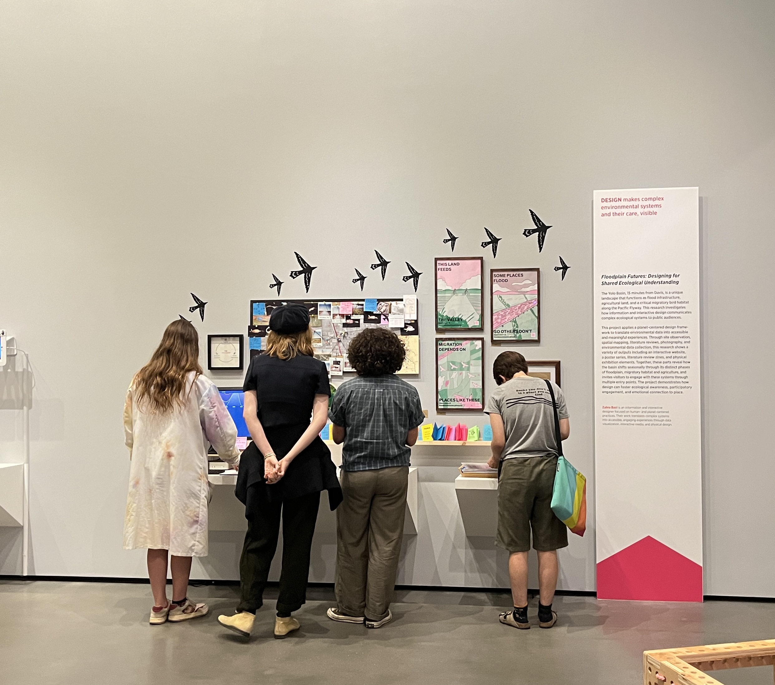
The exhibition opened June 4th, 2026 at the Manetti Shrem Museum at UC Davis and ran through June 20th. The space brought together every part of the project: the interactive website on a touchscreen, the bulletin board of field research, three framed risograph posters, hand-embroidered hoops, and a shelf of literature review zines to browse and take home.
installation process
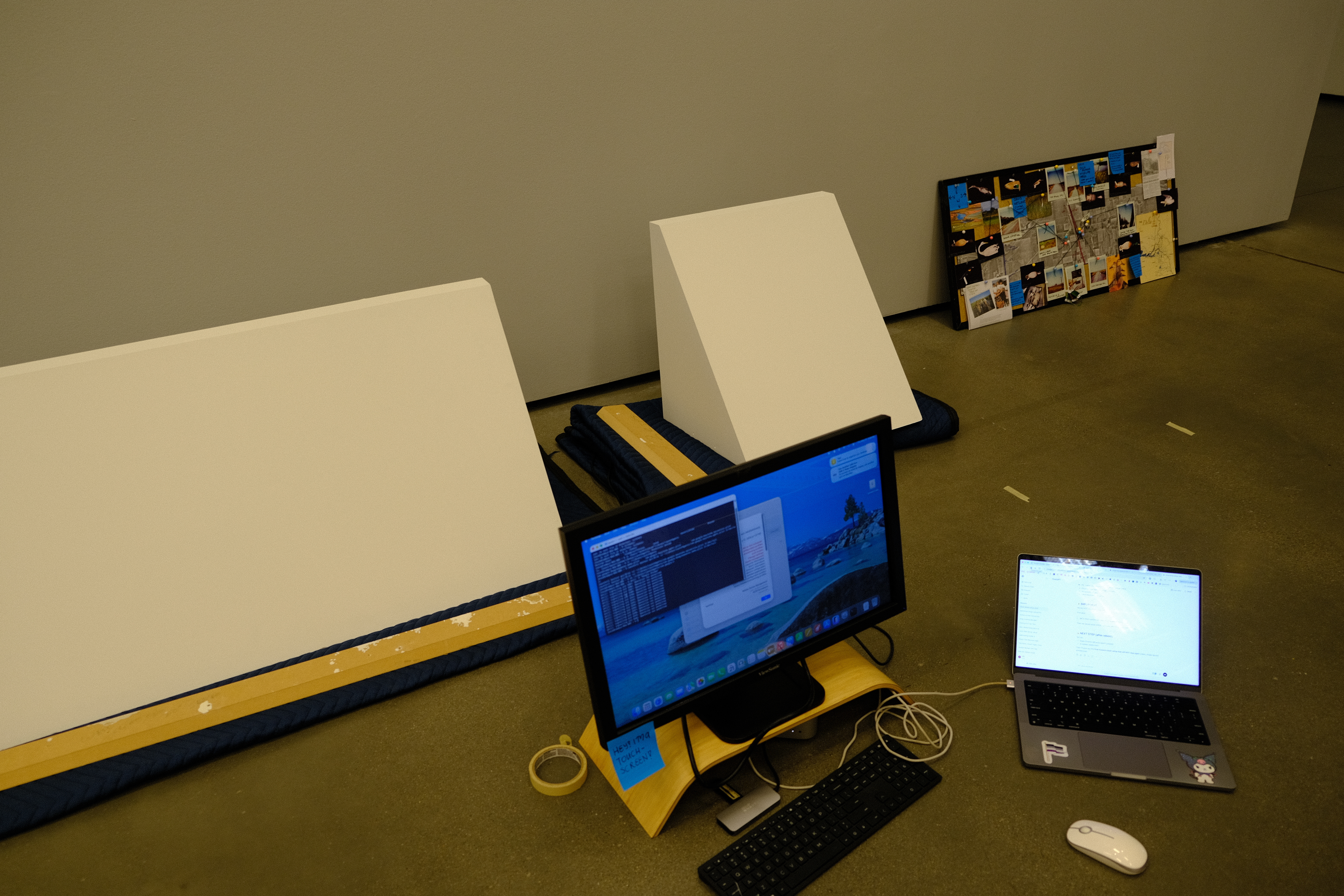
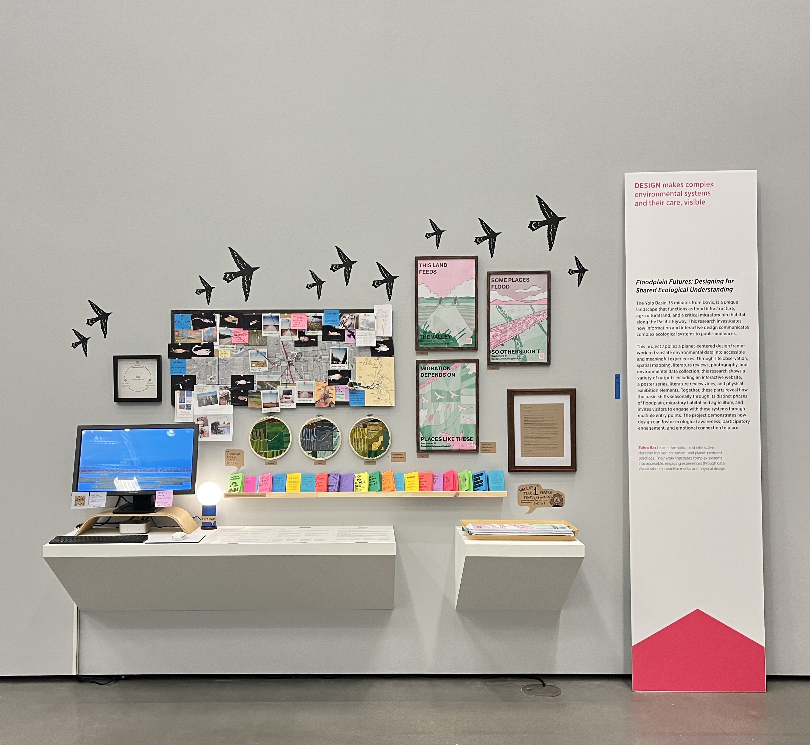
Installation took a few days for me to complete. Our design program has a class dedicated to prepping for this process but it is the student's main responsbility to develop and build their final exhibit. Coming from a background nowhere near exhibit design, I had a huge, but exciting, learning curve. I had to figuring out what goes next to what, how visitors move through the material, where the eye should land first. If I am real honest my favorite part of the project that really grounded the work and a fun eye catcher are the vinyl birds. I bought black vinyl and cut them out at home with my Cricut! It was my first time making wall decals and I would so do it again (maybe even with the same birds)!
installation views
thesis document
mfa thesis, 2026 · uc davis
Designing for Shared Ecological Understanding
Planet-Centered Communication through Interactive & Information Design
This work is licensed under CC BY-NC-ND 4.0 ↗. Available for personal reading only. Not for redistribution, reproduction, or commercial use without permission.
abstract
How can design help people better understand ecological systems they already live beside? Ecological understanding is shaped not just by scientific research but by also the tools and media through which that research is communicated. For most people the current mediums of communication remain out of reach, often buried in paywalled academic research and journals. These barriers make current ecological research misunderstood and often invisible. This thesis investigates how interactive and information design can make local ecological systems more accessible, participatory, and emotionally resonant for public audiences by using the Yolo Basin as a central case study. The Yolo Basin is a 59,000 acre seasonal floodplain three miles from Davis, that functions simultaneously as flood infrastructure, agricultural land, and a critical migratory bird habitat and path for the Pacific Flyway. Drawing from site observations and visits, spatial and seasonal mapping, photography, environmental data collection, and a literature review spanning across design methodology and floodplain systems, this research outputs into a multidisciplinary and multimedia project around three key systems at the basin: flood, flight, and food. The project uses a planet-centered design framework that treats local ecological systems as primary presences rather than a background context. The outputs include an interactive website, risograph posters, hand embroidered aerial maps, a physical exhibition, and a series of literature review zines. No single medium can communicate the complexity of this living landscape, and the multimedia approach with this project demonstrates that. This thesis contributes to the emerging discourses of planet-centered design, arguing that interactive and information design can foster ecological awareness, participatory engagement, and emotional connection to places we live near and within.
Coming from a more creative background, writing is not usually my biggest strength however I was incredibly excited to get to do this! The process of writing was challenging but rewarding. The document had to do what my design outputs couldn't: explain the reasoning, name the framework, situate the work inside existing research. Going in this direction I had to adjust as I had chosen zines as I feel academic journals keep knowledge locked away from the people who live closest to the landscapes they study however for this program writing a thesis helps me add to the research space and contribute to design methodologies.
These fields hold floodwater in January, grow rice in July, and feed birds all year. To understand the basin means understanding how these three systems depend on and enable one another.
thesis, p. 12
closing reflections
The exhibition closed on June 20th, 2026. Deinstalling felt like all things at once: relief, surreality, a little bit of exhaustion, and a lot of gratitude that it happened at all.
The most rewarding part was the messages that came after. Thank you to all the people who reached out online! So many people online and offline took the time to share with me what they enjoyed about the exhibit and their own story with the basin. I heard from others like myself who had driven past the basin for years without thinking much of it, and that something in the work made them want to stop and look. It was so exciting to see that my work made a difference and did exactly what I wanted it to do!
This project is meant to show that design can be a tool for making complex environmental systems easier to see, understand, and care about. The Yolo Basin is not a dramatic place at first glance, but it is doing a lot of work, ecologically and infrastructurally, and most of that work is invisible to the people who live near it. While this thesis is in someways done with my paper submitted and the exhibition is closed, the basin will always be there and my relationship with it will always grow. The point of this web page for my thesis is to break down my MFA experience in an accesible format and continue sharing the story and insights from this work with people like you! Whether you're a prospecting MFA student, community member, someone interested in environmental design, or anywhere in between, I hope you find value in the work. Please feel free to reach out if you have any questions or feedback!
the colophon
A colophon is a note at the end of a publication that describes the materials, tools, & people involved in making it.
- Designer
- Zahra Baxi: MFA Design, University of California Davis, 2026
- Website
- Built from scratch in Visual Studio Code w/ HTML, CSS, & JavaScript. Version-controlled w/ Git & hosted via GitHub Pages.
- Embroidery
- Three 8.25-inch hoops. Embroidered by hand using embroidery floss over printed maps & aerial photographs of the Yolo Basin.
- Risograph Posters
- Printed in emerald green & fluorescent pink on the Risograph from University of California Climate Action Arts Network (UC CAAN) at UC Davis. Black ink on top from the UC Davis Design department printer. Poster design by Zahra Baxi.
- Images & Media
-
Photos taken on the following digital & analog cameras: Canon EOS Elan 35mm (1991) w/ FujiFilm 200, Fujifilm X-T3 (2018), Polaroid OneStep 600 (1983), and Fujifilm Discovery 35mm (1994) w/ Portra 400.
Additional materials sourced & authorized for use from the following UC Davis departments:
- Museum of Wildlife & Fish Biology (MWFB) ↗: provided bird specimens for photography. Thanks to Irene E. Engilis for access to the Museum & Kevin Wu for helping identify & gather specimens for photography + checking taxonomy.
- Library Map Collection ↗: provided aerial photography used as site maps. Thanks to Michele M. Tobias for helping find material & John Pike for scanning. This map is a series of aerial photos taken in 1964.
- Archives & Special Collections ↗: provided Yolo Basin Foundation archival material, including postcards & event posters.
- With Thanks To
-
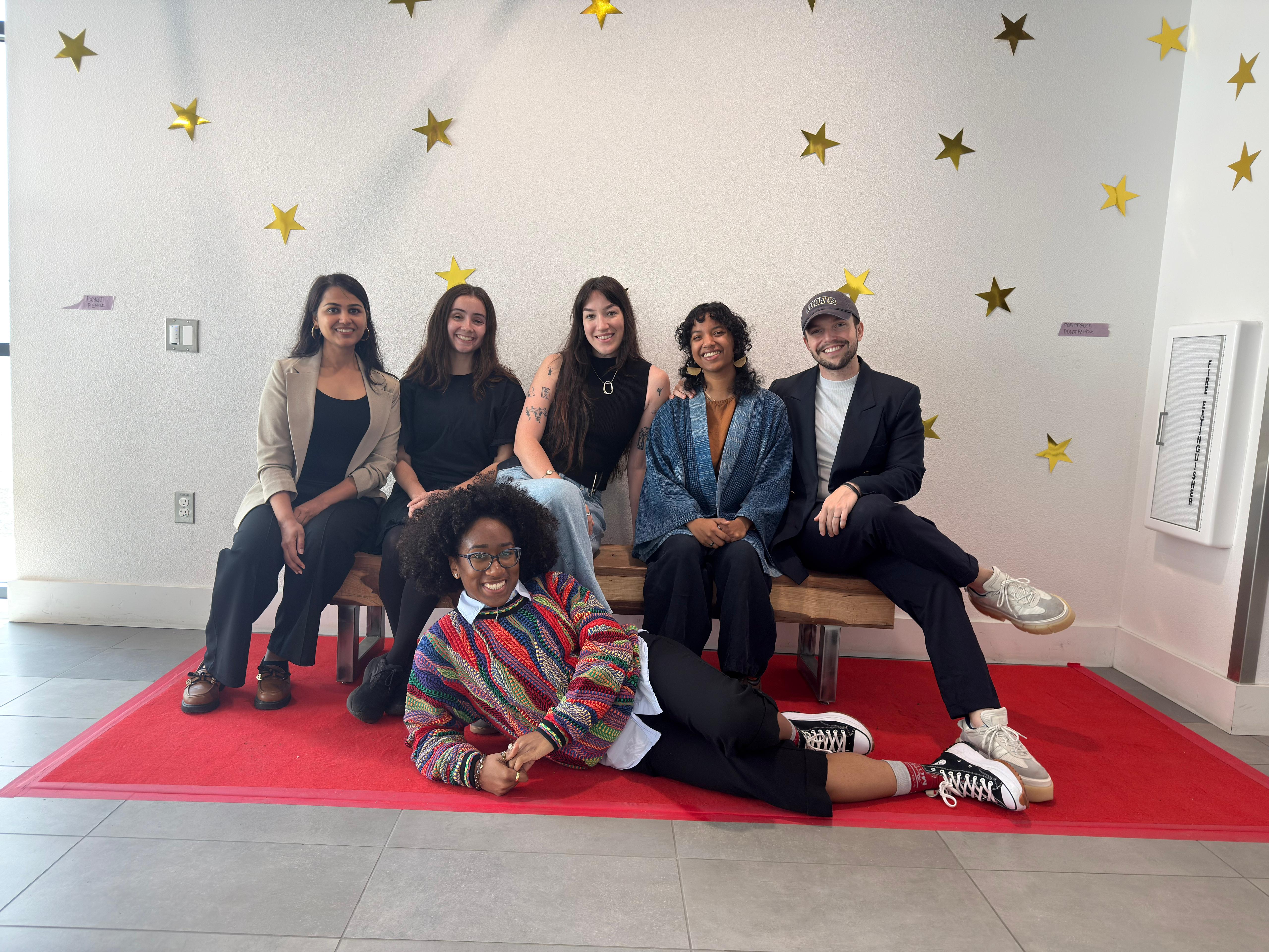
my amazing cohort & our mfa chair brett snyder on graduation day! the class of 2026 includes rafael bertacini, elieza delaney-lewis, nathalia guimaraes, nidhi mittal, megan plunkett, & emily tonnos. The MFA Design Class of 2026 cohort, whose feedback, company, & support shaped this project throughout.
My thesis committee, Glenda Drew, Brett Snyder, & Tom Maiorana, for their generous guidance & resources throughout the thesis process. Special thanks to my chair Glenda, whose support & mentorship over all the years I've known her is a large part of why I pursued this path at all.
My family, for their continued love & support throughout my time @ UC Davis.